Wrap your presents, sing Happy Birthday, and stuff a fist full of cake into your big fat gaping maw. Welcome to a very special edition of the Error Logs. Yes, it's our first birthday. That means we're now old enough to recognize our own name and crawl. Pretty soon we'll have to get a job, a mortgage, a divorce and next thing you know, BOOM, dead. Marvelous.
To say thanks for sticking around for the last year, I'd like to do a kind of community art piece with readers where I make an art piece with some of your images. Stick around ‘til the end of this issue to find out more.
And remember, keep being you. Your Self is not defined by the will or actions of others. Do kind things and make change through art.
Despite everything, it's still you.
News
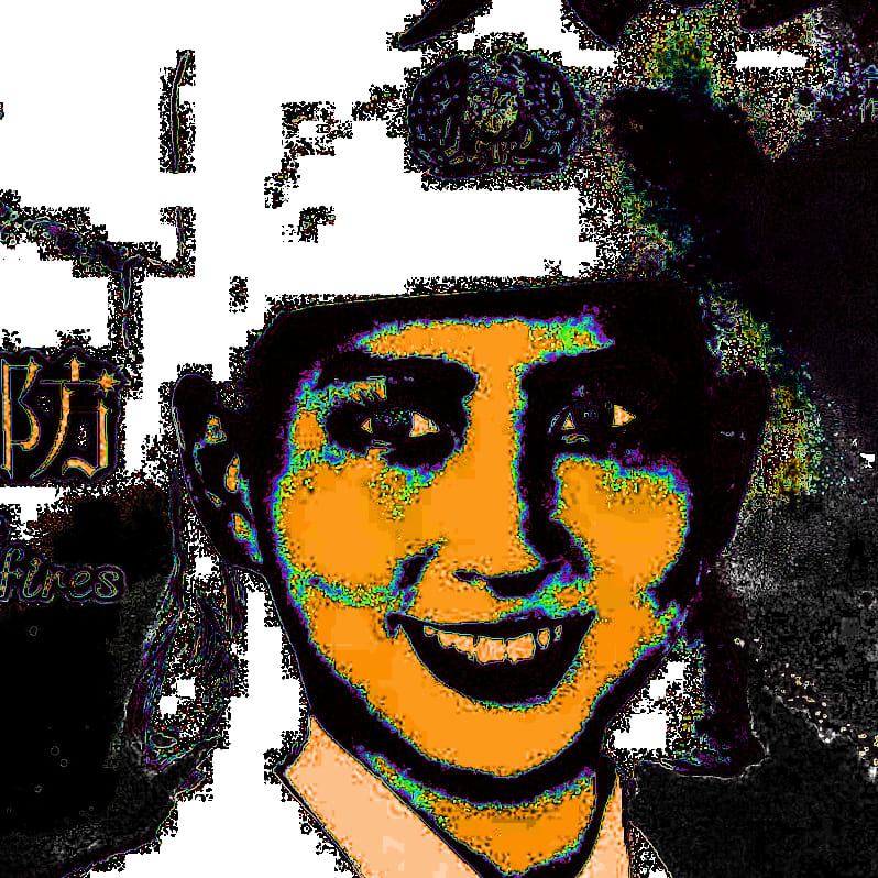
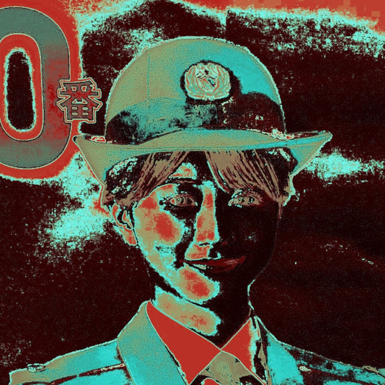
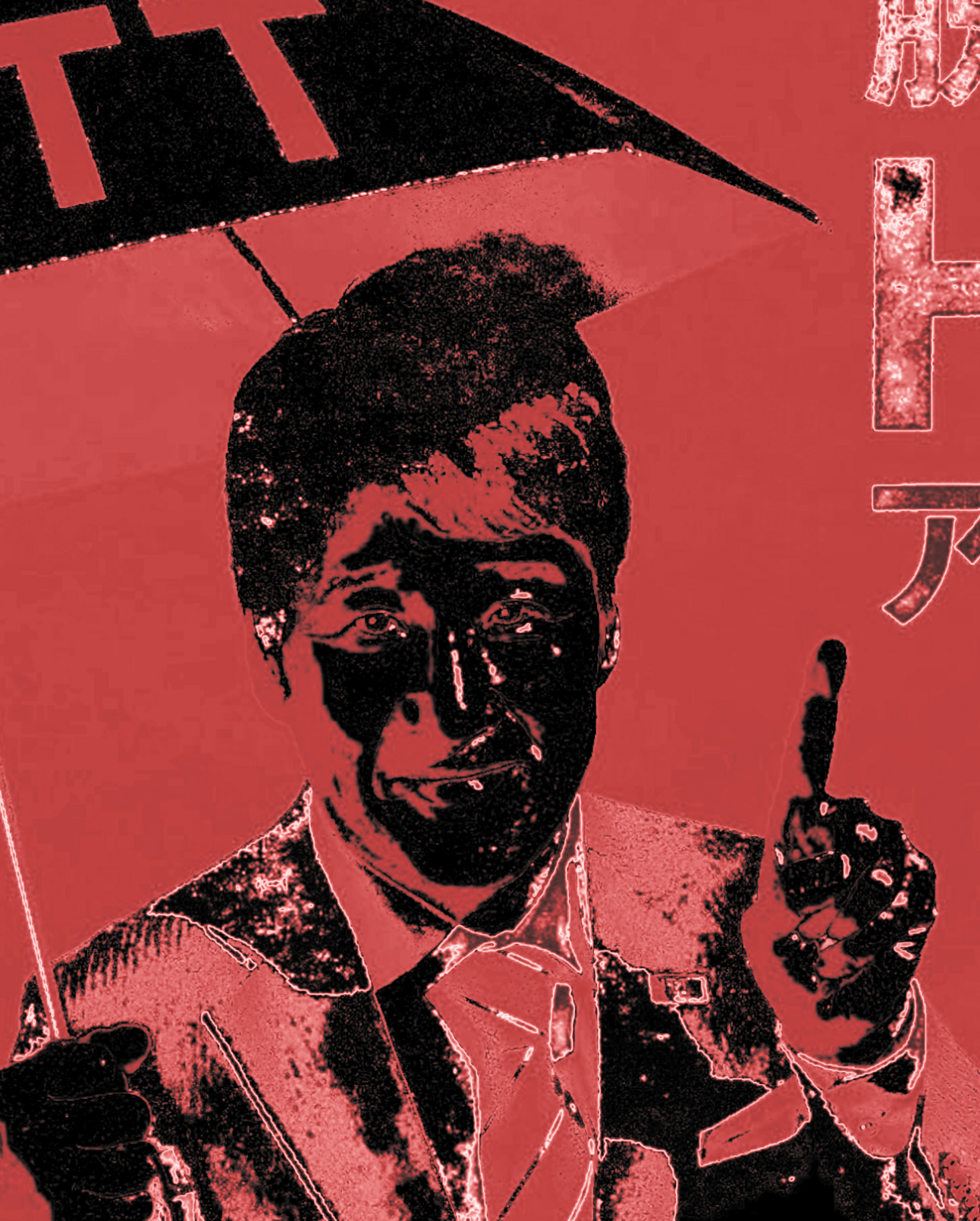
Not much going on at the moment. I've hardly even had time to make art this month. IRL is too IRL these days; I've been out and about wandering the streets of Tokyo for work. That has, however, made me rethink my workflow and try some new things that I can easily make while on the move. It's also given me an opportunity to find some great base images in the bazillions of posters you can see all over Tokyo. Adverts, PSA posters, Political Communications; there's no shortage of friendly, airbrushed faces ready to sell me the benefits of drinking pig placenta to keep my skin looking clear and supple.
That got me thinking, how do you opt out of being besieged by information constantly in these public spaces? Well, until someone figures out how to screw an ad-blocker right into my retina, it’s probably not possible. So, I'm taking back control; liberating the images from their masters, stripping them of their meanings, and recontextualizing them into something my brain welcomes seeing - nonsense.
I'm not watermarking these images as I feel the original image should belong to everyone, so I encourage you to remix these further and post them. Here's a few of the ones I like. I'll post the full set on my social media if you want to take any of them.
Also, I'm bringing back my weekly art challenges. I mostly stopped because Glitchtober was in full swing, but now that it's done I think now is as good a time as any to bring it back.
My first challenge is this weekend; glitch a corporate logo.
Check out my social media for info. Everyone is welcome to join in.
Spotlight: Yuni Yoshida
Back in Error Logs #9 when I did the spotlight on Kenichi Nakaya, I said I would start doing more features on Japanese artists, so it's time to put my money where my mouth is and eat all those tasty ¥5 coins.
I mentioned back then that there's not a huge, dedicated glitch scene in Japan, but artists here tend to take the aesthetics or philosophy of glitch and apply it to other mediums. Kenichi Nakaya, with his glitch sculptures, was a great example of that, and today I'll be writing about another artist that applies glitch in her own unique way.
Yuni Yoshida is a not a glitch artist in the traditional sense, at least not in her published, professional work (who knows if she spends her free time removing the i-frames from videos trying to achieve that perfect datamosh).
But, she is massively influenced by the aesthetics of glitch. She's an artistic director and runs her own creative agency. A lot of her work has been used for fashion brands and TV shows. But, the most important thing is that she has an amazingly creative brain and the talent to pull off her visions.
I think I first came across her work a couple of years back when I saw the posters for the Japanese TV drama, Elpis. The poster has the three main characters standing in office setting surrounded by piles of paperwork. The paperwork has the same colour palette as the characters, which creates this cool real-world glitch effect. Actually, it reminds me a lot of the pix2line effect that I wrote about in last month's tutorial (go read that if you haven't already)
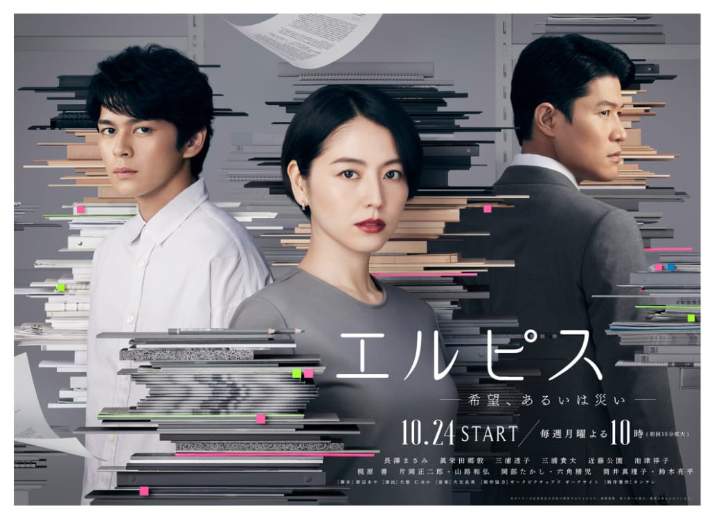
Elpis (2022), Fuji Television Network, art by Yuni Yoshida
I never watched the TV show, so I can't comment on how well the design reflected the concept of the show. It's a kind of murder mystery, so I'm not really sure if my interpretation tracks. But I find this kind of 'office glitch' interesting. It kind of makes me think that because we spend such a large proportion of our time at work, our true personalities are corrupted by our work, and it becomes an extension of our self.
A common theme in her work is 'glitching' everyday objects by deconstructing them physically. Nowhere is this more evident in her food glitches. What does it mean to glitch food? Thankfully, it doesn't mean dropping a screw into a can of tuna (I saw that episode of Kenan and Kel).
Here are a couple of her works that mix technological themes with fruits and other foods. I especially like her pixelated series where the food is exhibited as pixelated cubes, as to show its artificially, processed nature.
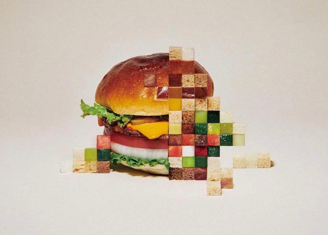
“LAYERED” - Yuni Yoshida [2018]
I also really like her series of Zoom fruits, where the fruits have been arranged so that they look like someone is pinching and zooming on a photo of fruits using their tablet. As someone who was raised when GM fruits were becoming popular, I feel that we’ve become uncompromising in our standards when it comes to fruit and veggies. Anything with a slight blemish and we refuse to buy it. We have created this impossible beauty standards for our fruit in the same way that we do for people.

“ZOOMING UP” - Yuni Yoshida [2023]
More fruit related shenanigans in the next image where she plays with some colour theory and asks the age-old question of what would happen if you genetically engineered an apple with banana (orange, obviously)
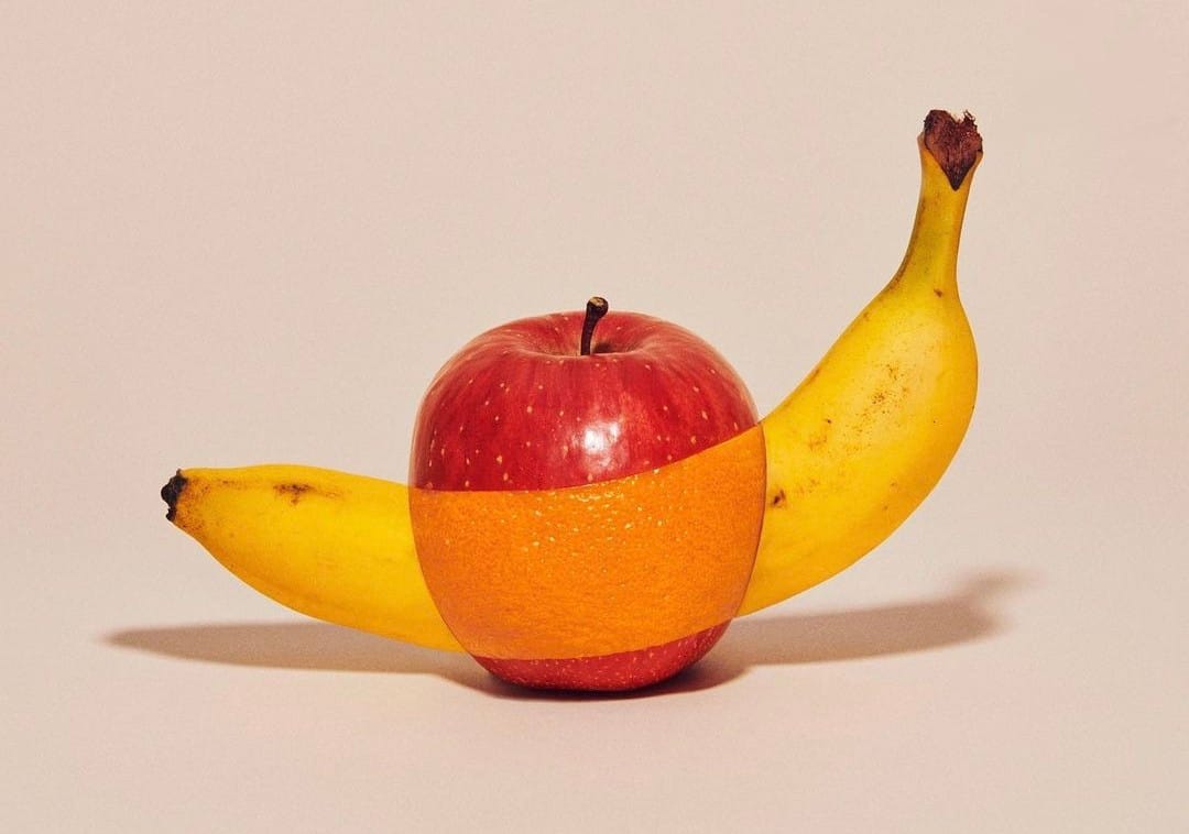
“PEEL” - Yuni Yoshida [2019]
Greengrocers can breathe a sigh of relief, as not all her work is fruit-based glitches. Some of her fashion and cosmetic work involves her manipulating the body in different ways.
With these images she made for cosmetic brands, she applies the pixel effect to her models. Rather than dicing her models up into little fleshy cubes and reconstructing them as meat pixels, like some kind of horrifying Minecraft (Mincecraft?), she thankfully applies the pixels with make-up.
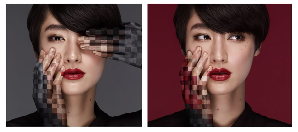
“DOUBLE TONE” - Yuni Yoshida [2018]
I also like this image, which while I don’t know the name or date of, I’m assuming was made for a fashion brand. It's like body horror but everyone seems to be having such a good time. It's as if all the characters of the Great Gatsby were replaced with Slenderman, or one of those draught excluders shaped like a sausage dog.
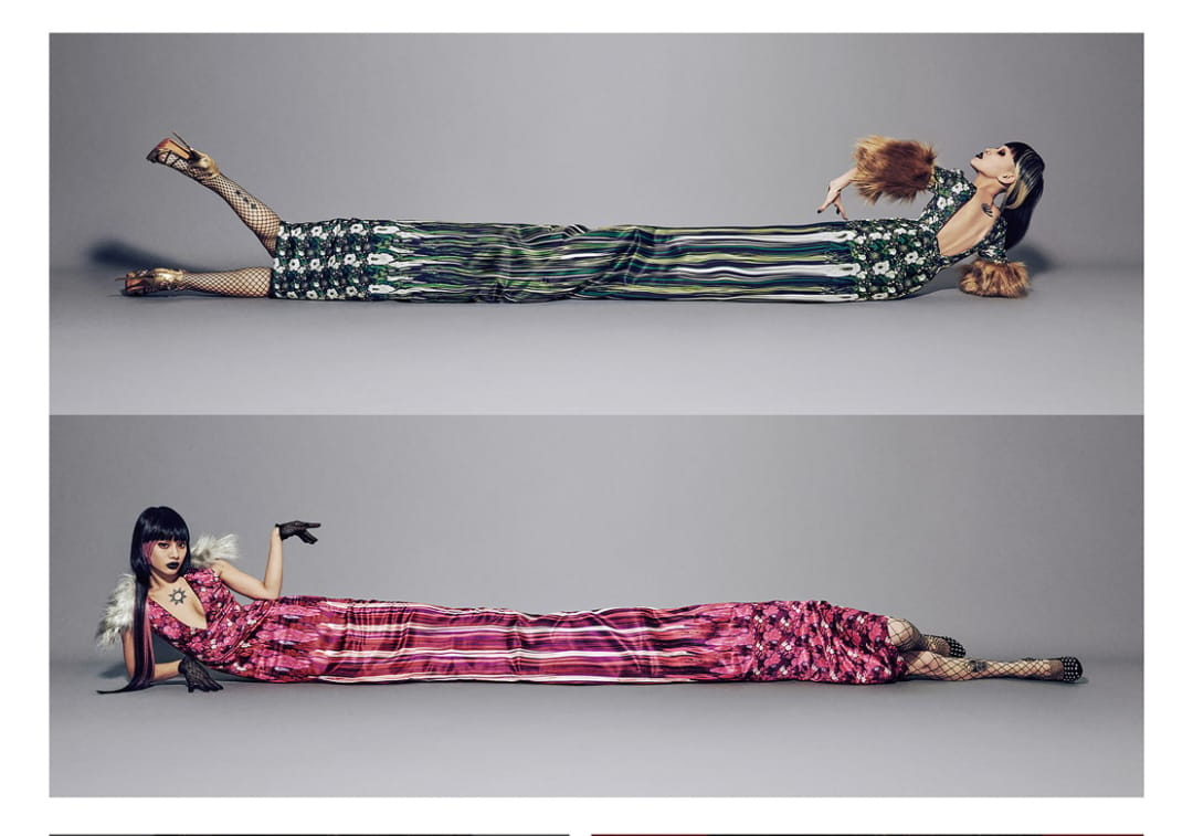
Name and date unknown - Yuni Yoshida
Glitch Video: A$AP Mob; Yamborghini High
I think I might have caused some controversy with last month's review of Linkin Park's Emptiness Machine music video. The angry mob of Linkin Park fans (or perhaps fans of Joe Hahn's film, Mall) have been throwing rocks at my house. Or maybe that's just my neighbours wanting me to remove my Halloween decorations.
Anyway, this month we have a new music video full of glitchy goodness. Like I said last month, I feel like the Linkin Park video was a bit of a missed opportunity, so this month I wanted to choose something that reps glitch art a little better. Today's serving is A$AP Mob's Yamborghini High.
Look, I grew up in the rugged moorlands of northern England. The extent of my knowledge of hip-hop is learned from Parappa the Rapper, and as good a teacher as he was (“I gotta believe.”), that was 25 years ago. Nobody is really interested in what I have to say about hip-hop. I do know the song, released in 2016, is a tribute to ASAP Yams, the founder of the hip-hop collective, who sadly passed away in 2015.
Now, this is not the first hip hop video to use datamoshing. It seemed to become a bit of a trend around this time period, which started with the Kanye West video for Welcome to Heartbreak (2008), and was copied by a ton of other artists until its ubiquity was eventually satirized by visual artist Yung Jake in his 2011 song Datamosh (if you only click on one link this newsletter, make it that one). I guess A$AP Mob were a little late to the party, but that doesn’t mean it isn’t a great video.
So, onto the video then. If last month's Linkin Park video was glitch done wrong, then this is glitch very much done right.
Directed by Shomi Patwary, and with visual effects by Robbie Simmons and Unkle Luc, the video features lamborghinis in vivid, surreal hues racing around a forest, while members of the group, wearing camouflage also in vivid channel swapped hues, perform the song and eat cereal. Each scene transitions into the next via datamoshing courtesy of the very talented Unkle Luc.
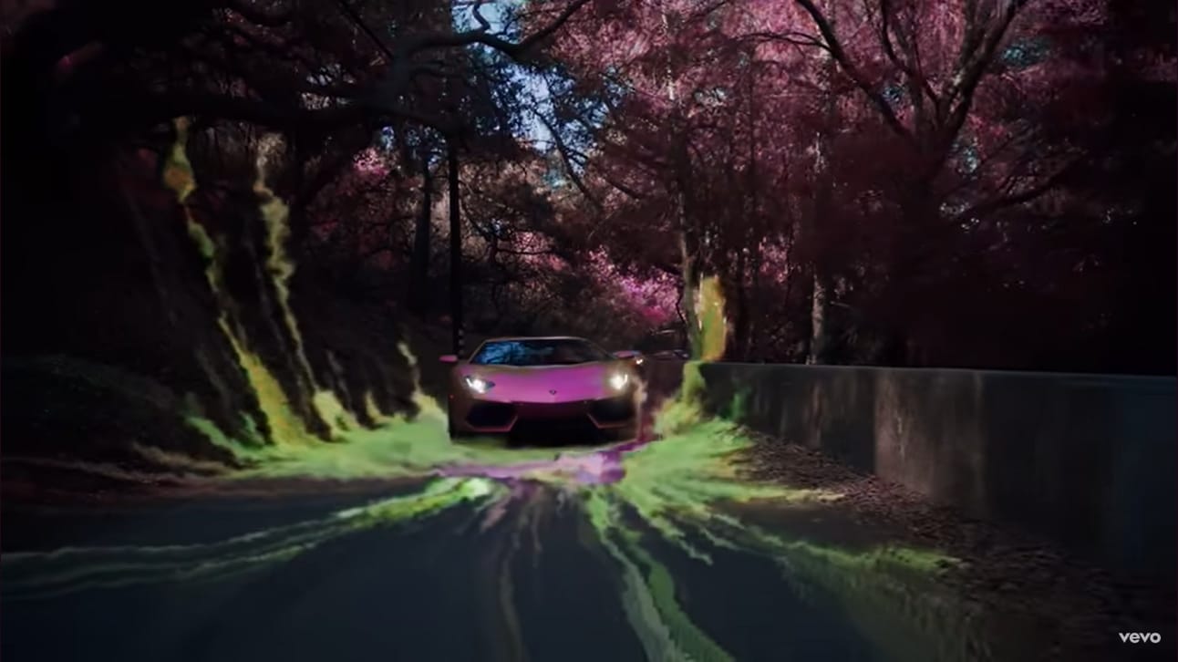
The video feels ethereal and otherworldly and matches the vibe of a song, with its choir-like keys that sound like we’re about to pass through the pearly gates.
I love the way the trippy hues combine with the datamoshing. The strong hues give off the vibe of this heightened state of feeling, but the datamoshed transitions suggest this transcendental, fuzzy perception. Perhaps this is meant to represent the titular Yamborghini High (which I now realize is probably a high so powerful, it's like the Lamborghini of highs, and not a series of YA novels about a group of potato-powered supercars navigating the pitfalls of high school life.)

Simply put, what I love about this video is that it doesn't just feel like some gimmick that was used to create a fun, throwaway mainstream music video. There's something kind of special about the way it all fits together and creates this new aesthetic.

Something I’ve always mentioned when talking about my own glitches, is that the groundwork you put in before you start the glitching, can have a major effect on the end result. And I think that’s demonstrated really well here, as I think the camouflage outfits work really well with the corrupted pixels that hang around on the screen after the datamosh, and it blurs the line between what is reality and what is part of the glitch.
The video also works with the music too, not just lyrically and thematically, but also how the transitions match the beat, which helps to elevate the song into something even better.
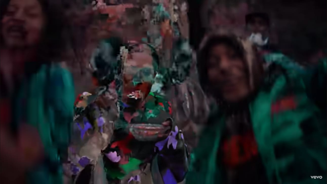
Start your morning off with Glitch-Os
Tool time: Drawing Generative
And so, we continue with the Processing script tutorials. If you're not familiar with Processing, check out my Primer tutorial in Issue 8. Last month I introduced a script from the GenerateMe pack of scripts. This month, we'll be taking a look at another script from that pack, Drawing Generative.
The script can be downloaded from here.
So, ‘generative’. That's a dirty word, innit? I hear you cry "How can you generate AND draw? It's an affront to the sacred relationship between Human and Pencil. It's an oxymoron." Well, before you make an oxymoron out of yourself, it's not the kind of generative that makes certain types of artists apoplectic with rage and spit out their morning Glitch-Os.
“Actually, they’re Hatsune Miku Pon Pon Flakes. You degenerate philistine.”
So, you can pick the cornflakes out of your beard, wipe down your waifu, and go back to getting to know your pencil better. Just make sure to sanitize it thoroughly before using it (that goes for the pencil and the waifu).
I'm actually not really sure how it works. The blurb on the script just says 'draw image based on strokes using channel values'
This is just a guess, but it might use vector fields, which is a technique mentioned quite a lot in the GenerateMe blogs. Basically, the canvas is split up into squares, and each square is assigned a direction. The script then chooses some points to start drawing and the 'pencil' follows the direction of the arrows until it hits an end point. The start/end points and directions of the arrows depends on what channel is chosen. Or maybe it's all magic.
It's not one of my go-to scripts, but I have used it in the past in some of my works. Of course, you can kinda just use it to 'trace' images, but I find it works really nice for making abstract patterns or surreal abstractions of objects (especially when you zoom in on things). Here are some examples.
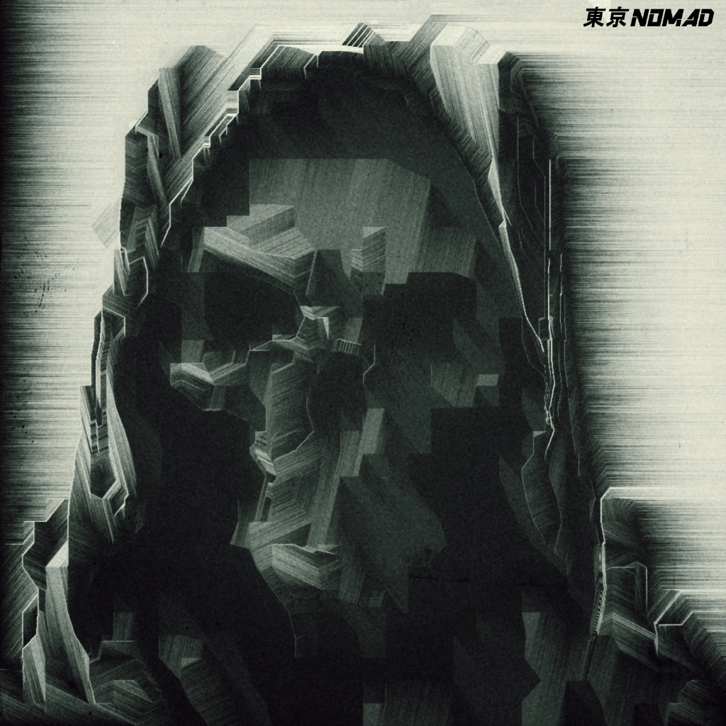
Loss, tokyo_nomad_ [2023]

Pestilence, tokyo_nomad [2022]

Fiore (Fibres), tokyo_nomad_ [2021]
So, how do you get it to do something cool? Compared to last month's pix2line, there aren't really a whole lot of parameters to fiddle around with. Basically, you can select the channel that guides the lines, and the number of iterations that the script runs.
So first of all, we need a control image. For this issues experiments, I'm bringing back your friend and mine, yes it's Hiram Powers’ Clytie statue from the Smithsonian art museum (who I used for last month’s newsletter)
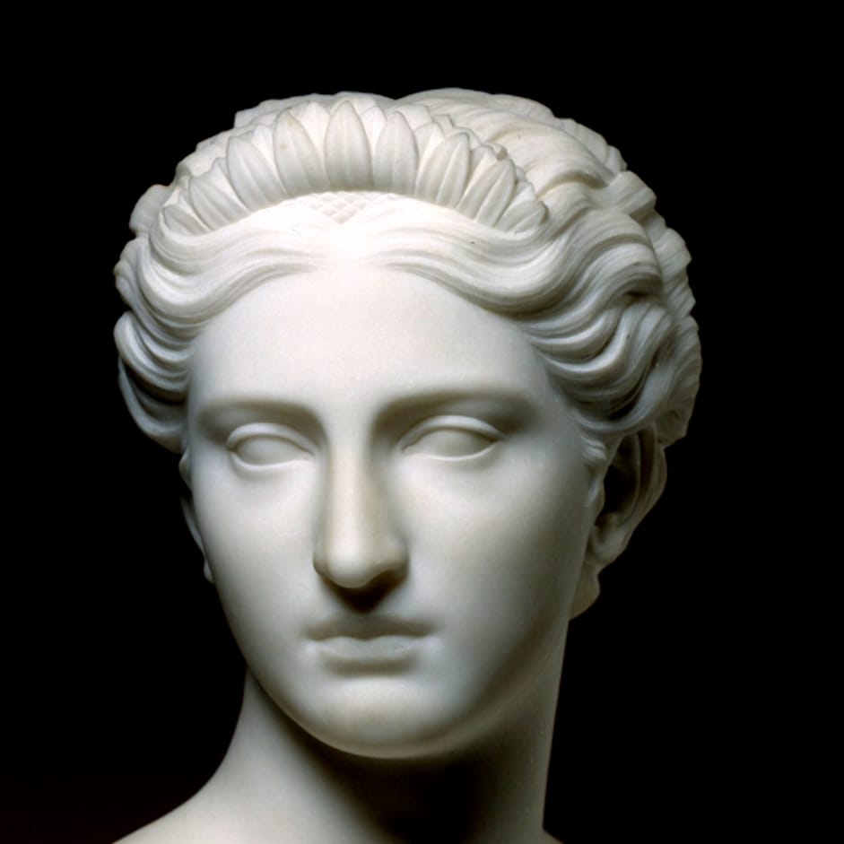
Yo. Wassup?
I’m not going to go into detail as to how to input the image into the script. Check out my previous Processing tutorials if you want to know how to do that.
So, let's take a look at what it looks like when you change the channel parameter.
There're a few channels to choose from, the three colour channels (RGB), Brightness, Saturation and Hue. There are also N variations of all the channels (NHue, NSaturation, NBrightness) which I’m assuming means Negative Saturation and so on. Think of these as their evil twin variants, the Wario to your Mario. Waaaa!
You can change this setting here:
// choose channel
int channel = BLUE;
Just change the white text (remember to keep the case the same)
All of these experiments are run at the default 30 iterations.
So, first up let's do the colour channels.
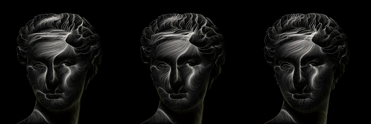
1. Red 2. Green 3. Blue
Ok, they look pretty much identical. But it wasn’t exactly the most colorful base image. What if we change the original image to red and try them side by side?
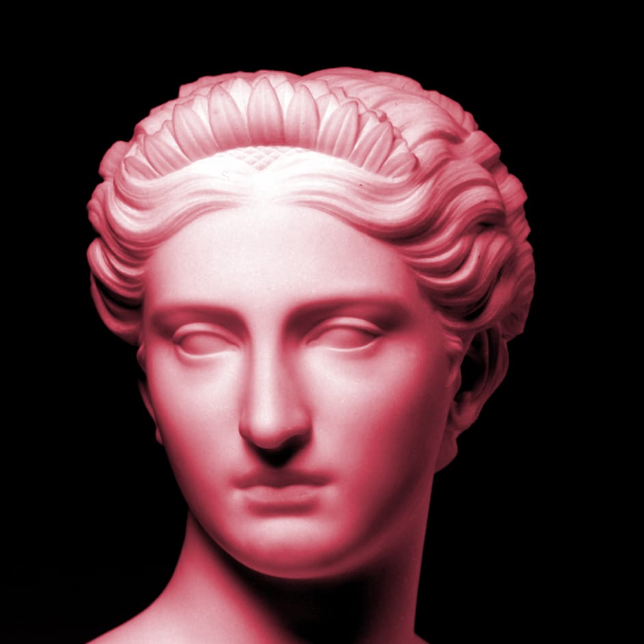
Falling asleep on the sun loungers after a couple of margaritas wasn’t a great idea

1. Red 2. Green 3. Blue
So, the first obvious thing is that the lines take on some of the colours of the original image (which wasn’t obvious in the first image because it wasn’t very colorful). But you can see the way the lines behave when I chose the red channel are very different to the green and blue channels (which are a lot more similar to the outputs when we inputted the original white version of the statue). The are a lot more individual, separate lines in the red version, whereas the lines in the green and blue version tend to converge into one bigger line.
So, how about the other channels? These were all run on the original white statue.
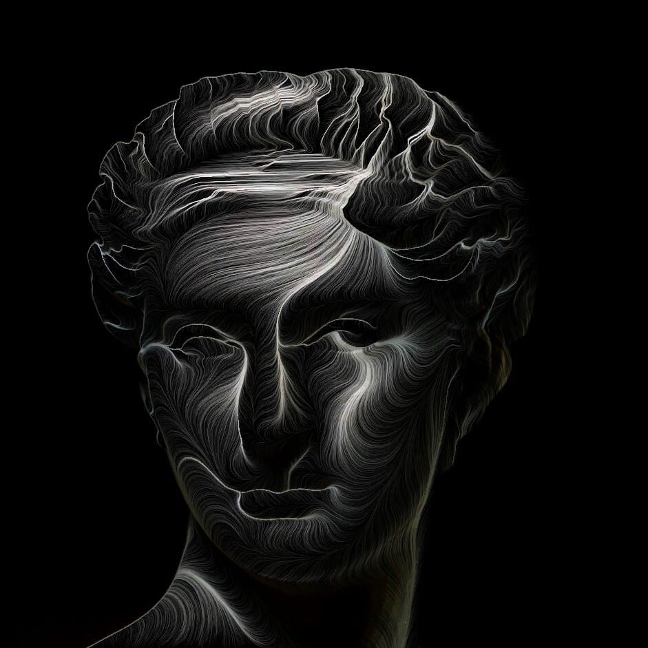
BRIGHTNESS
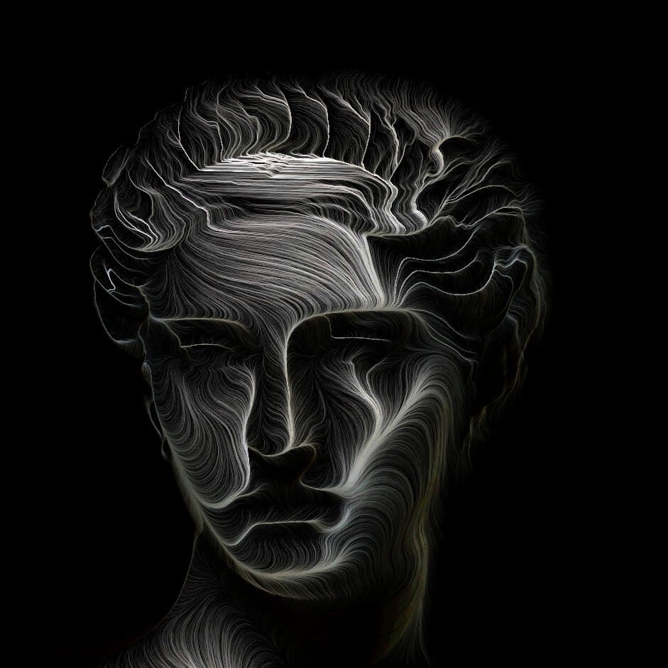
NBRIGHTNESS
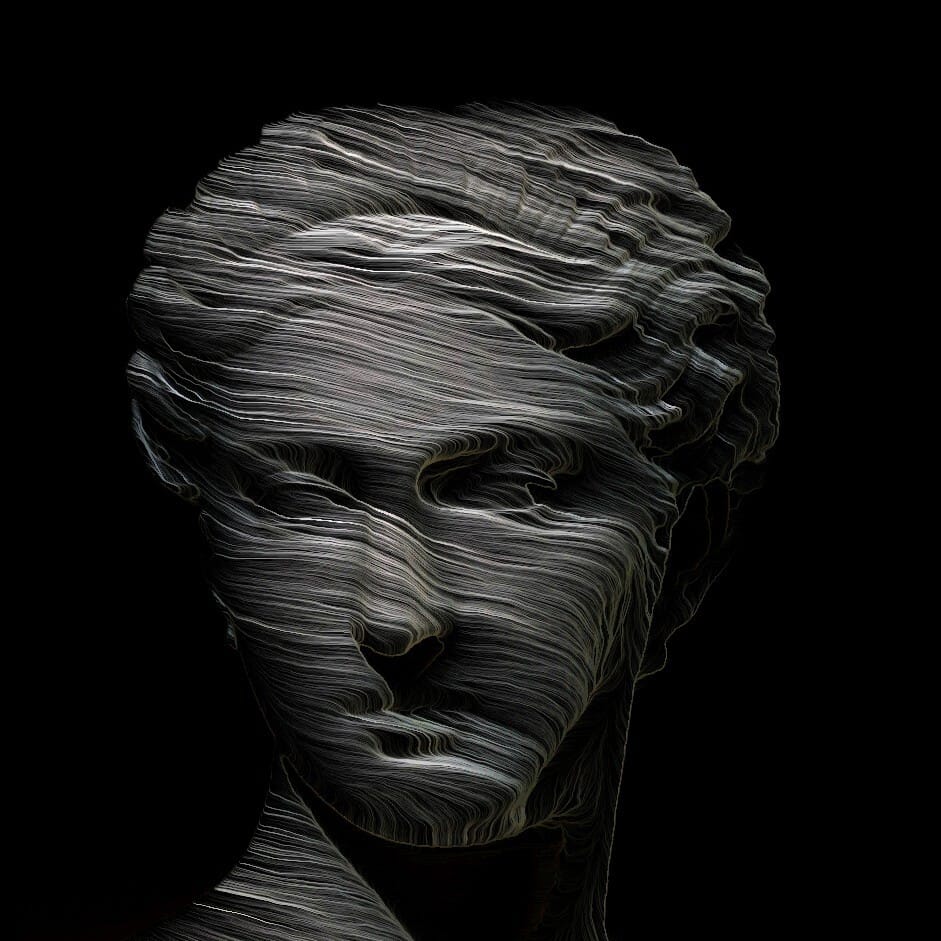
SATURATION
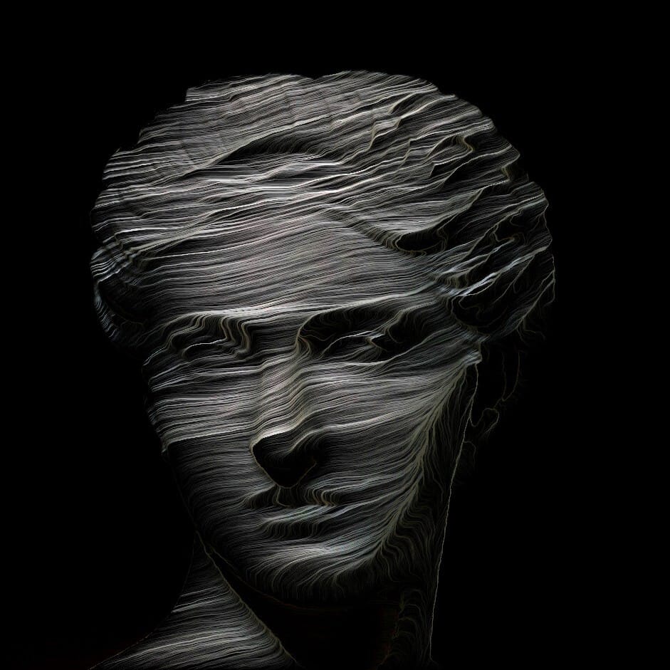
NSATURATION

HUE
NHUE
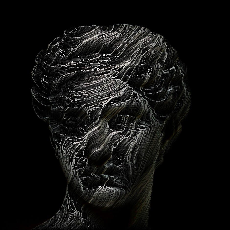
You can see there’s huge difference between how Brightness, Saturation, and Hue behave. Brightness behaves a lot more like the colour channels we already tested, whereas Saturation looks more like the Red channel version when the statue had a red tinge to it. And Hue looks very chaotic, almost like crashing waves in a stormy sea.
The N versions of each channel seem to change the direction of the pencil strokes. I actually assumed that it would work in the opposite way to their ‘non-N’ versions, but seeing as the black space is not affected when we use brightness, I’m not sure that’s the case.
I was kind of curious what it would look like if I had an image with a lot of hue changes, so I made a version of Clytie with a rainbow gradient to see how it would be affected.
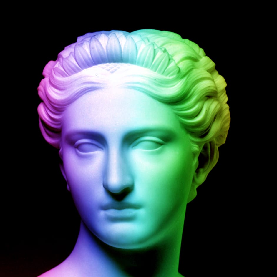

What I found interesting about this is that it looks completely different to the Hue channel output on the white statue input. So, it seems like you get this nice, smooth effect when the the script finds an abundance of the colour aspect you’re working with. So, in this case, there are a lot of different hues, so it comes back smooth. The white version of the statue has no hues, so it’s chaotic. That’s why the output of the red channel version was smooth on the red version, but the others were more chaotic (but not completely chaotic because the shades of red in the image still contains bits of green and blue).
Actually, one thing I noticed when I was glitching some of my previous works based on this base image, is that the direction of the lines change depending on the colour of the hue, as you can see in the purple and brown parts in the images below.
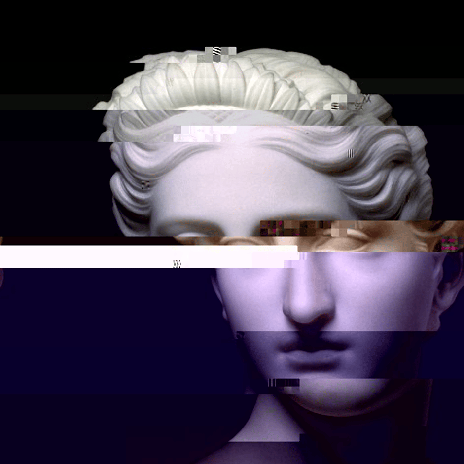

You can see the purple parts are almost vertical while the brown part is more diagonal.
So, that all leads me to believe that it’s important to consider what values your image contains when deciding what channel to use (depending on if you want a smooth or chaotic drawing, or something in between)
Finally, let’s take a look at the iterations parameter.
You can change this setting towards the bottom of the script
 buffer.endDraw();
  if(tick == 30) keyPressed();
Here’s the regular input run through the script with the BRIGHTNESS channel with 100 iterations.
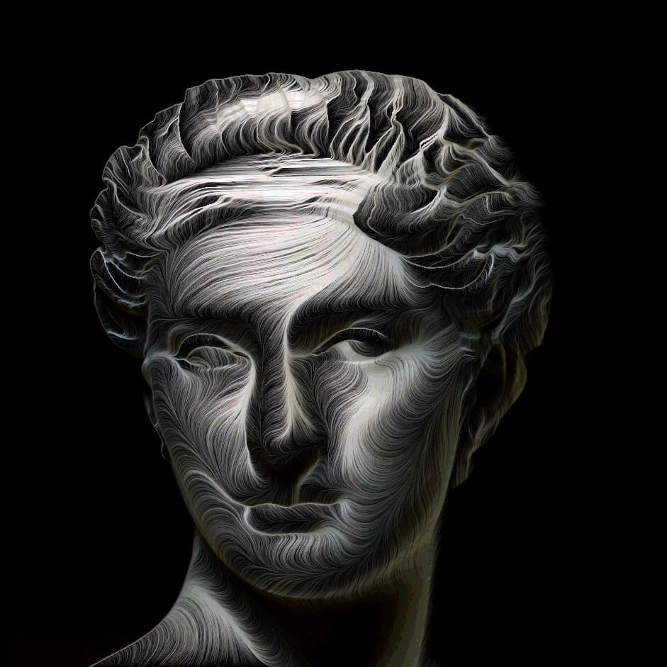
You can see that the lines are a lot more distinct, and the image pops out a lot more than the 30 iterations version in the beginning of this tutorial.
It can be a skill finding a good balance, because if you do too many, the effect starts to look washed out.
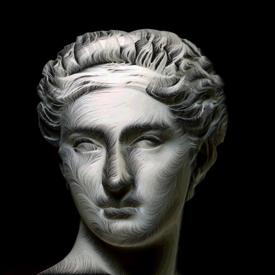
278 iterations - I think 277 was the sweet spot but I forgot to hit save
That's it. A whole year of Error Logs. Thanks for sticking around. Hope they had some use for you. Or at the least, that they've been mildly entertaining. Something to read while you're having a poo.
To say thanks, I want to do a kind of community art project. I tried doing something similar after my Fubar workshop, but nobody ever sent me any images. So, for some reason I'm trying again.
Basically, I'm asking you to send me a regular or glitched portrait image, and I'll glitch, stitch and blend them all together. It doesn't even need to be you, send me a glitched portrait of Steve Gutenberg. Just don't send me any wankers and try and keep looking like a passport photo style.
You know, something like this

eww
And I'll try and make something like this
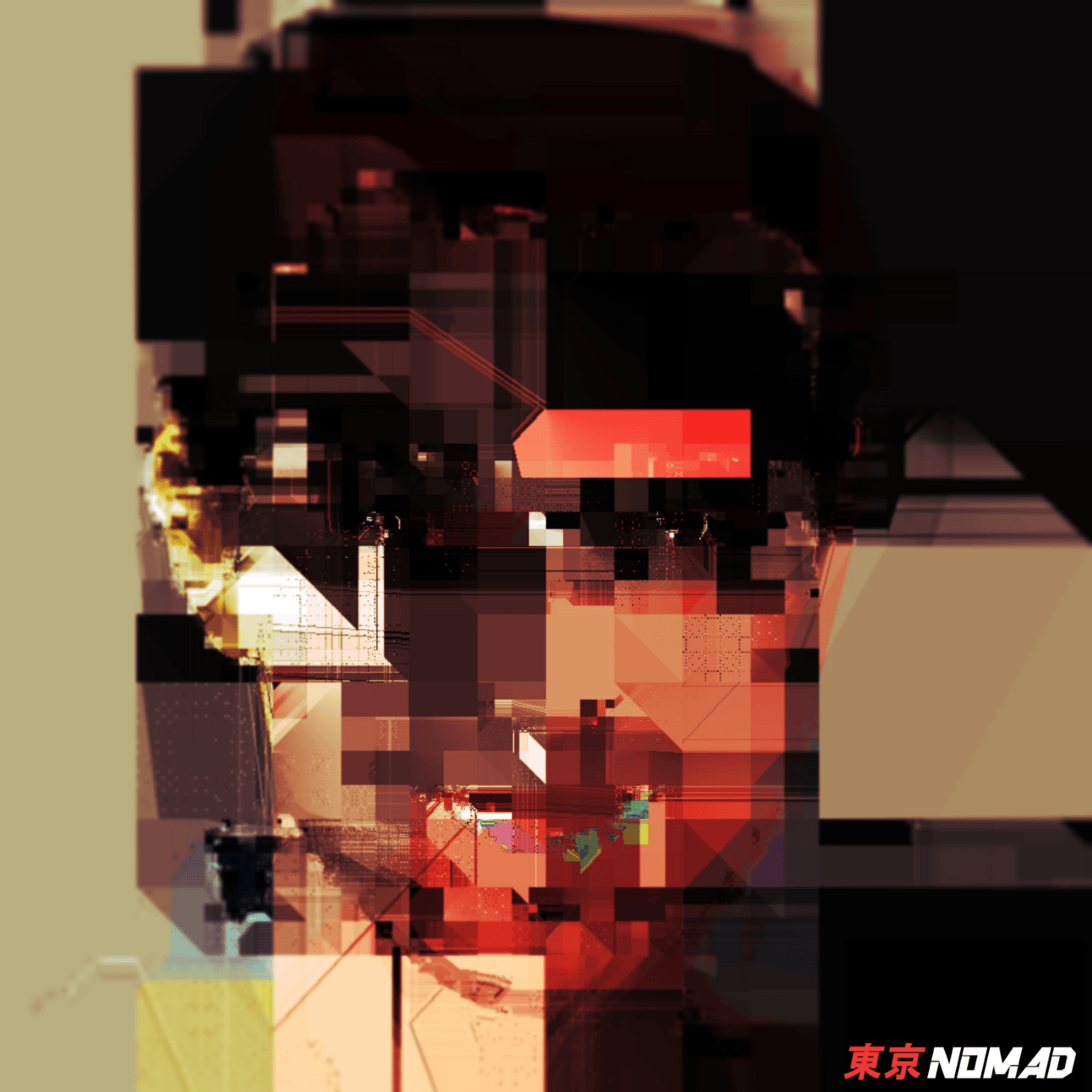
It's just for funsies. I'll post and tag any contributors on IG and feature in the next issue of the Error Logs.
Also, let me know if you have any feedback about the Error Logs. Anything you like? Hate? Want to see in future? Is it too long? Too short? Too angular? Drop me a message on Instagram to let me know.

