October. The month named after the humble Octopus. It's been a good month in the art world. Actually, I don't know if that's true because I'm writing this on October 2, which is 2 days after publishing Error Logs 10. It's good to get a head start in writing these things. But I'll assume it was a good month.
These next few months are going to be extremely busy for me. My daughter is going to be taking her school exams in a few months and we're going to be hunkering down on that. I still want to continue writing and publishing the Error Logs each month, so I've decided to reduce the size of these a little. More offal. Less waffle 🧇
So, welcome to this slimmed-down Halloween-themed October edition of the Error Logs, which is packed full of glitch art. Inside we have a spotlight on one of the artists that inspired me a lot when I first started making art, cyberart_by_justin, another Processing tutorial for a cool glitch effect, a new feature on glitch art music videos, and lots of spooky scares.
News 👻
Okay, now that we've got the spooks out of the way, let's get down to what October is really all about; glitches. For those that don't know, it's Glitchtober. That means 31 days, 31 prompts, and 31 chances to make some glitch art. It's always a great opportunity for artists to challenge themselves with doing something a bit different, as well as find a new audience. To be honest, I haven't had so much time this month, so I've mostly been enjoying what other artists have been making, and it's been a really good chance to see some new artists. Still, I managed to get a couple of prompts done.
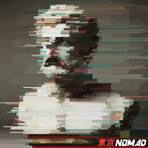
Day 5: Statue
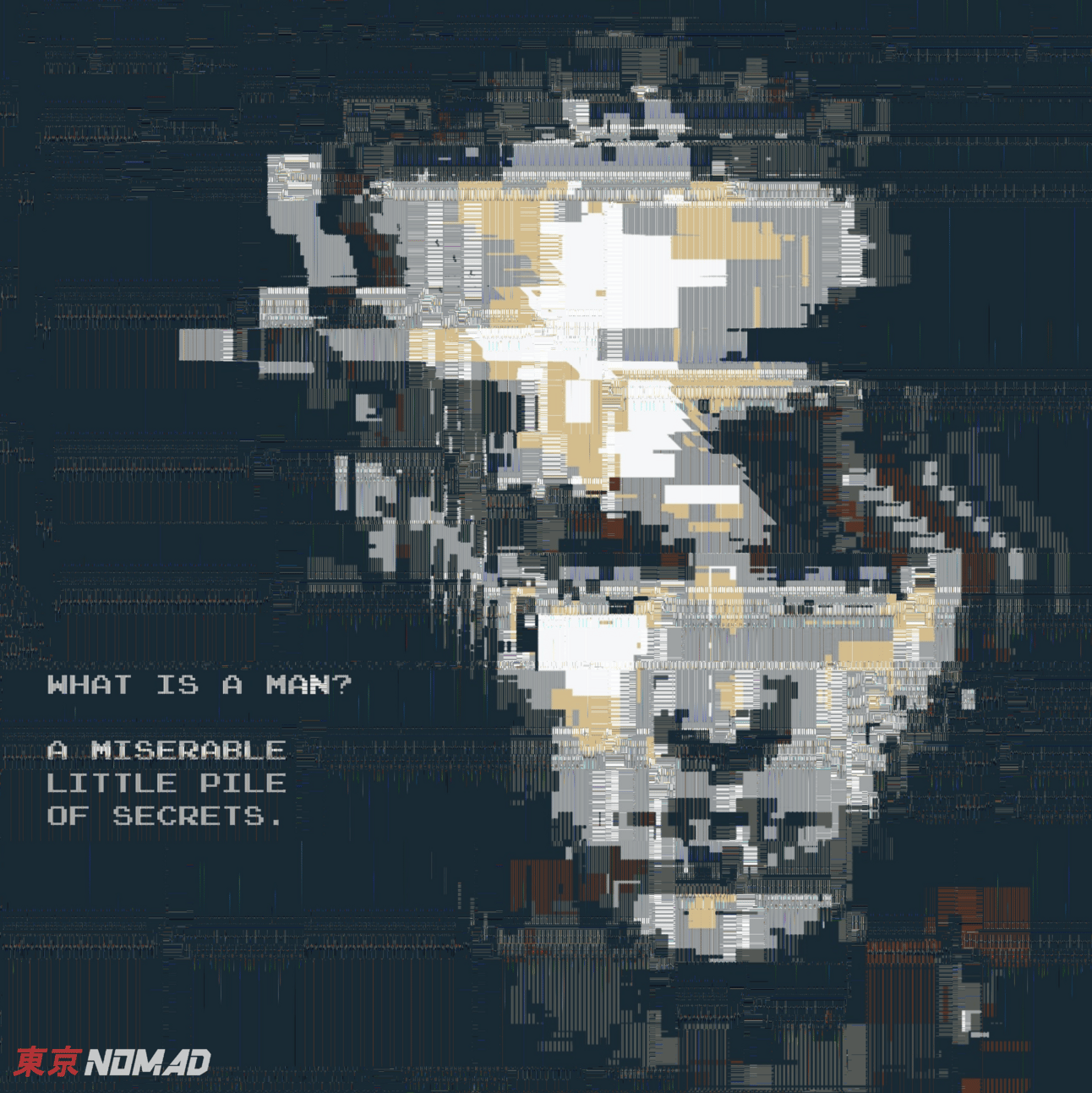
Day 8: 8 BIT
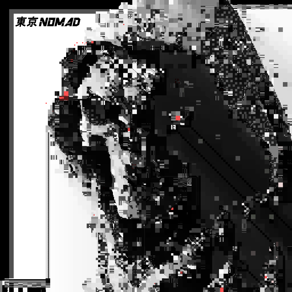
Day 13: Reap
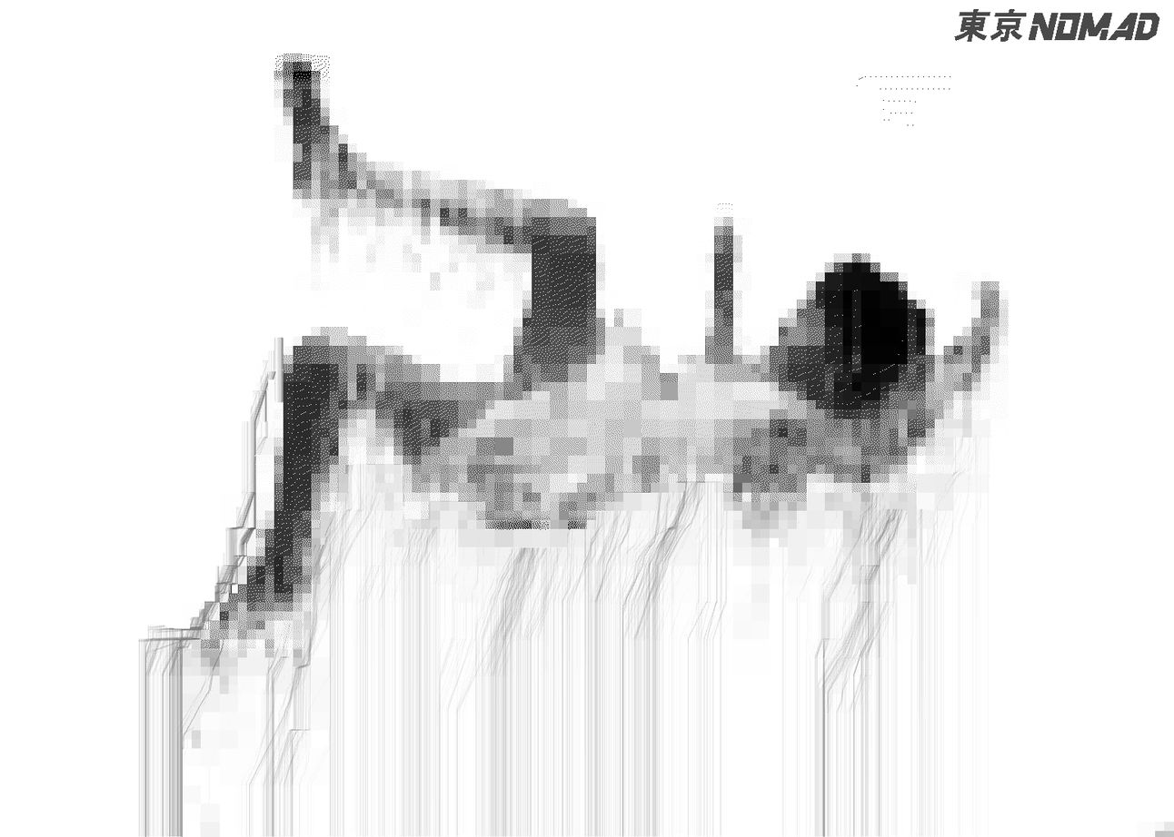
Day 19: Fall
Error in control
You may remember a couple of issues ago I mentioned my work would be featuring in the exhibition Error In Control. Sadly I wasn't able to go as Tbilisi is a bit of a trek from my house. But I'm curious if anyone reading this went (hit me up if you did, I'd love to hear about it)
It was an enormous pleasure to be asked to participate, and I was surprised when they asked to use some of my older works. Now that the exhibition is over, I'll share what I had displaying there
It's my first time to have my work exhibiting where I didn't have control over what I was exhibiting. They chose the works for me. That brings it's own challenges if the works are from different series and have different intentions behind them. You have to make a write-up that ties them all together, so you end up playing the role of both artist and critic.
In theory you can write any old nonsense, but where’s the fun in that? These kind of situations force you to contextualize your own work in relation to itself and allow for a bit of introspection and reflection on your body of work.
The four works submitted are from various series made back in 2021.
The theme of the show was about the flaws in human systems. Here's my write-up for the show.
“What is a machine?
The machine is stable. The machine seeks perfection. The machine does not get sick, or feel sad. It doesn't need to take coffee breaks. It does not make mistakes. At least not ones it wasn't designed to make. These mistakes, or glitches, are often caused by human error. Glitches are the human imprint on the machine.
I use glitch as a medium to explore what it means to be human. My earlier work mostly focussed on using glitch to distort and corrupt cultural semiotics, as to shine a light on the ridiculousness of social constructs. My later works seek to explore human emotions and imperfections as seen through the lens of a failing machine.”
Here are some of the works I exhibited
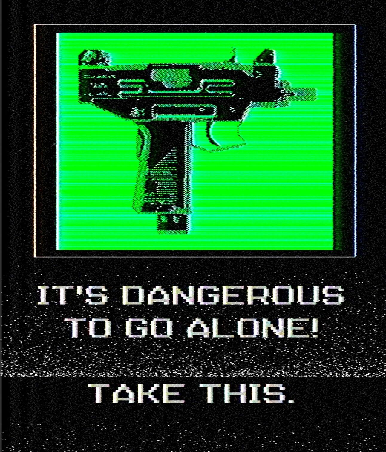
Protection (uzi), tokyo_nomad_ 2021

Protection (crucifix), tokyo_nomad_ 2021
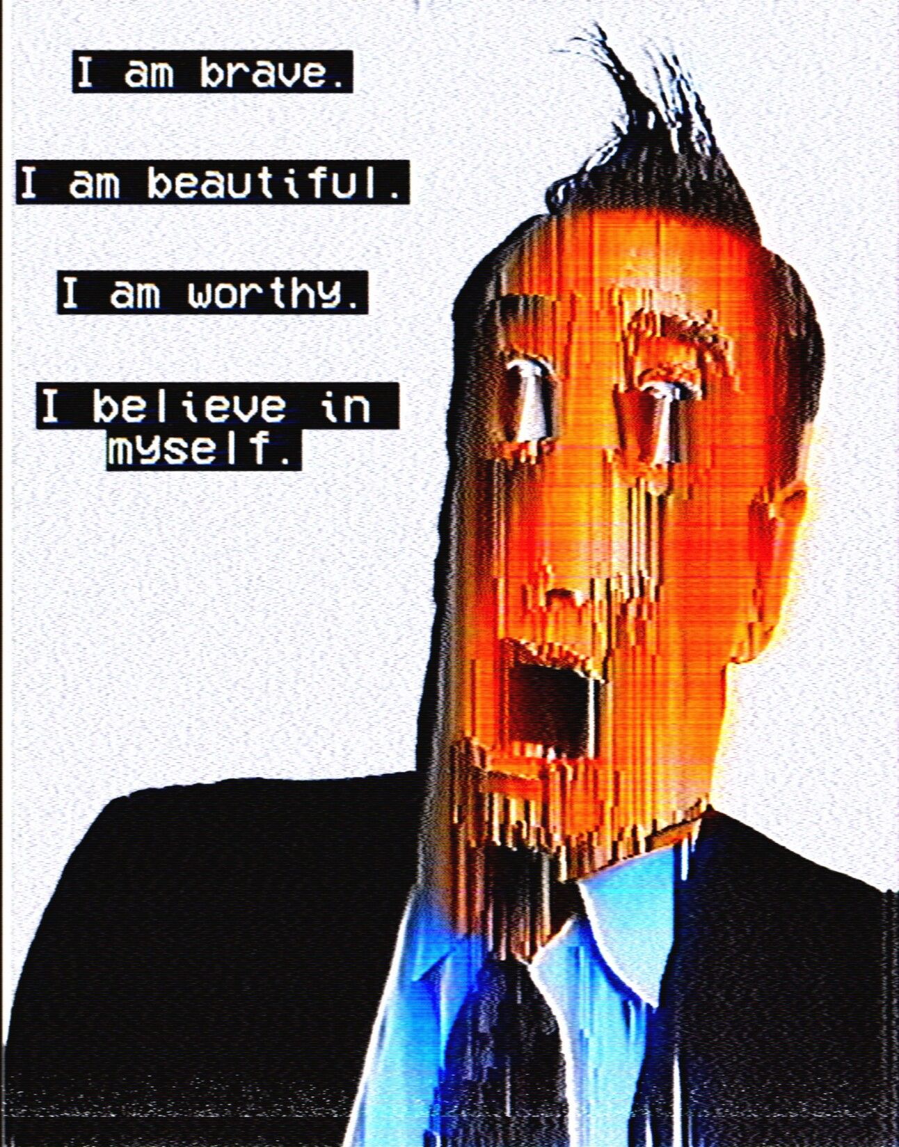
Positive Affirmations, tokyo_nomad_ 2021
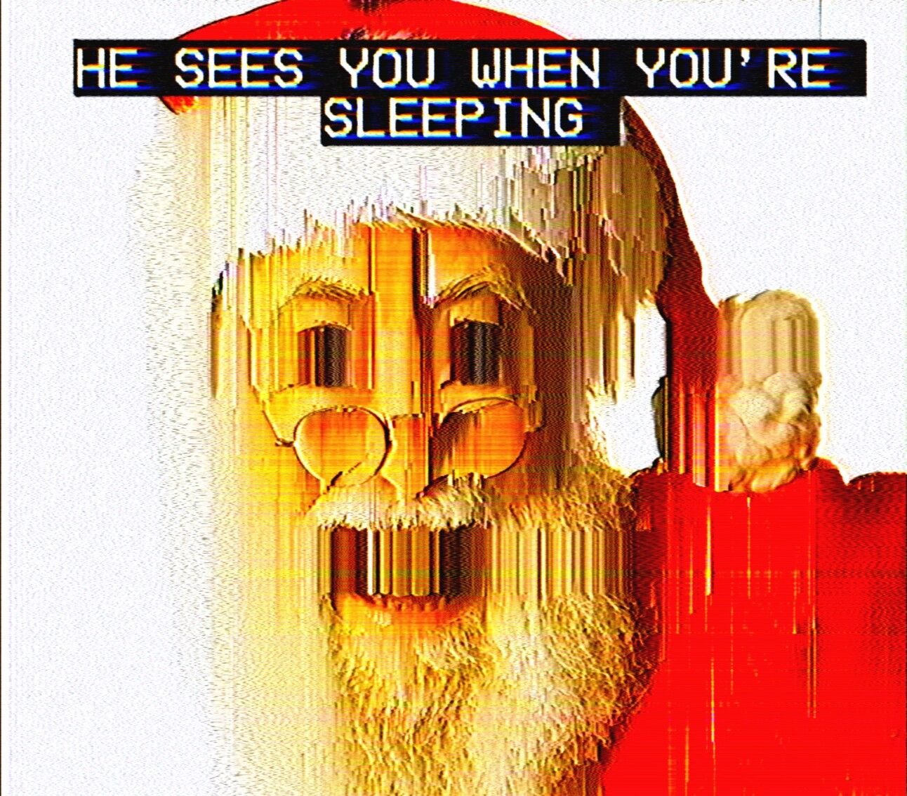
And here’s my statement on my exhibiting works.
“The one theme that ties all of these works together is that they are all subversive in some shape or form. They take common cultural signposts and iconography, and subvert the message from its intended context.
Two of the pieces are from my Protection series, which show a selection of items displayed alongside the text "It's dangerous to go alone, take this" from the classic NES game, The Legend of Zelda. In the original game, these words are spoken by a mysterious old man as he passes a sword to our hero at the beginning of his adventure. We're all the 'hero' of our own stories whether or not those stories are good, bad or mundane. I reimagined this scene with different items such as a sandwich and thermos, depression medication, an uzi, and a crucifix so that these scenes can be applied to different protagonists.
Positive Affirmations is part of a series I did where I took these motivational phrases that can be seen in different places, from the LinkedIn business variety, to the Pinterest Girl Boss ' variant, and placed them alongside these distorted, uncanny valley-esque characters. The contrast of these statements next to the horrifying creatures is meant to highlight the hollowness of the statements, as cheap as the plastic frame housing a "live, laugh, love" print.
The final image chosen for this series, featuring a terrifying Santa Claus, was a riff on the Positive Affirmations series. It was created just as a Christmas post for social media, but seems to have taken a life of its own. Again, my intention was to subvert the classic depiction of Santa Claus by distorting his image and captioning it with lyrics from the classic Christmas song "Santa Claus is Coming to Town" to take on more sinister undertones. Who is this man that we collectively allow into our homes once a year while we sleep?”
Fubar
Good news everyone! As one glitch festival door closes, another one opens. I've been lucky enough to have my work selected for this year's online Fubar festival! Looking at the list, there's a lot of stuff I'm really looking forward to seeing, so if you want to check out the full list, head on over to their website.
The online festival should start in the next few days.
Spotlight: cyberart_by_justin 💀
I want to look back at when I first started making art, way back in the distant past. Back when I still was Edo Nomad (geddit?). Summer of 2020. Back in the old days of Instagram, when Mark Zuckerberg was still learning how to be human. I first discovered glitch art through a handful of artists whose work I'd see on IG. One of those artists was cyberart_by_justin.
I’ve been following his work for a really long time, and I've written about his work in a previous issue of the Error Logs. He is the author of the GlitchFX script that I wrote about way back in issue 4 (go take a look after you’ve finished reading this).
His works are liminal. They inhabit the spaces between genres. Glitch. Vaporwave. Abstract surrealism. They blend nature with geometric patterns. They feel familiar yet unique. Calming yet uneasy. They have this uncanny quality, like a mountain spa getaway decaying into the end of the universe.
I also really love how he blends different techniques together to create something new. He uses the resulting mix of glitches like a paintbrush to fill the liminal spaces.
So I want to share a couple of pieces that I really like.
First up is Doomsday_exe.
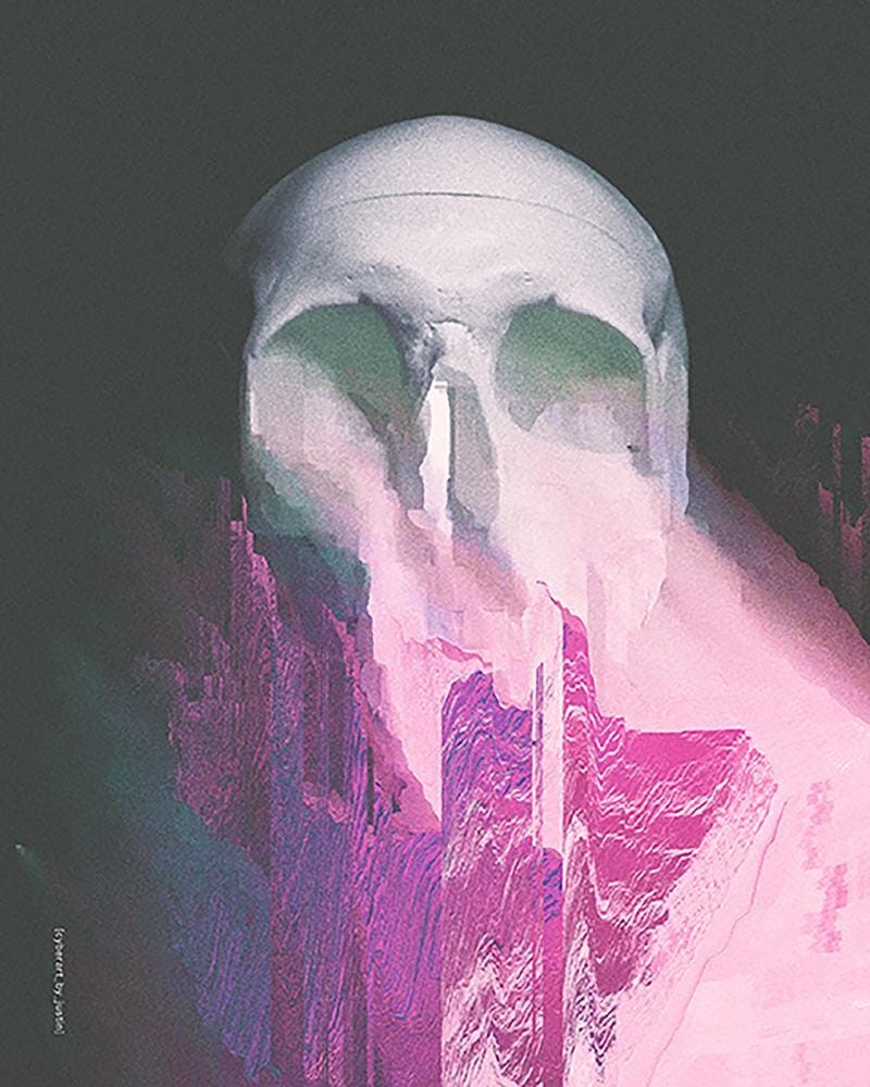
Doomsday.exe, cyberart_by_justin
I love the ways the gradients melt into each other. The muted, dark grays of the sky suddenly exploding into these green, blues, purples and pinks and back again, which creates this rugged mountain, on top which sits this ginormous skull, like some kind of supervillains lair. The way in which the glitches are blended makes me feel like the skull is vomiting up the earth, as though the skull is giving birth to the world into the blackness of the void. "On the first day, the Giant Skull God vommed up the land"
As a nice callback, this was actually created as a Glitchtober prompt back in 2021. We have come full circle. Lovely stuff
Another work I love is Envy.
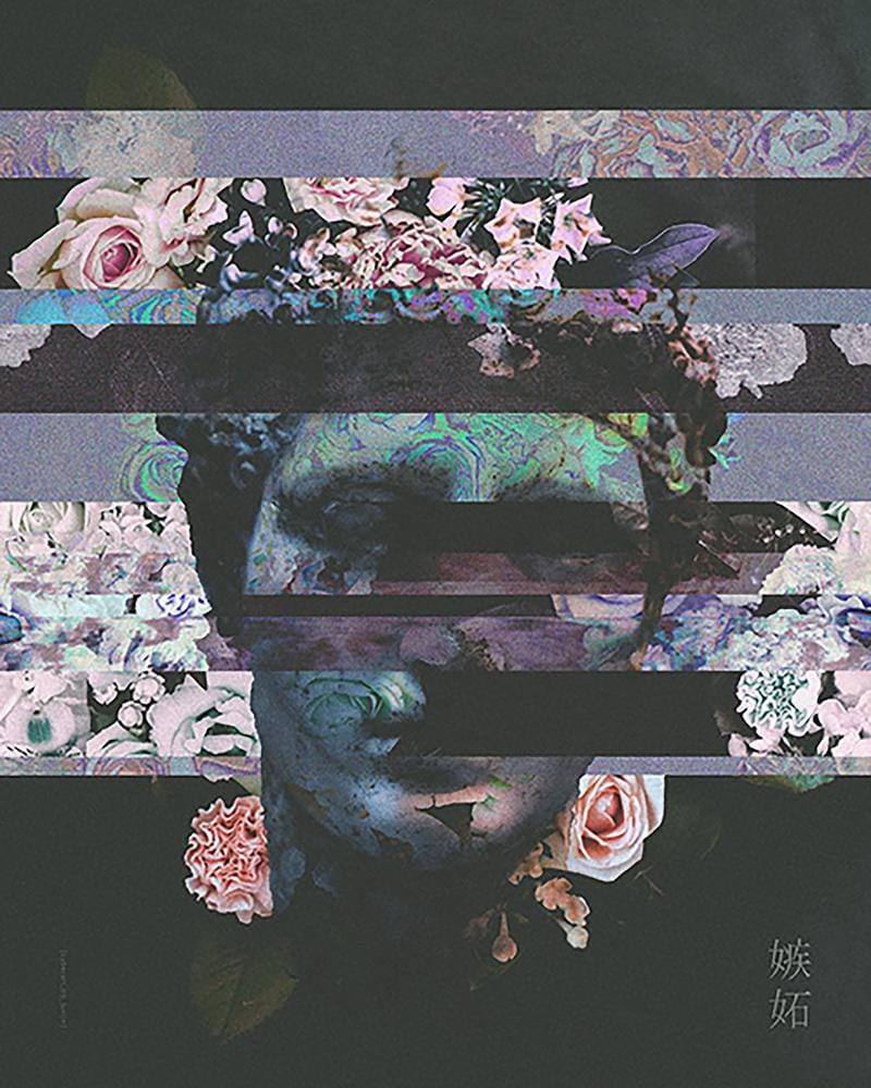
Envy, cyberart_by_justin
I really dig the colourfully muted palette, which I think works really well with the flowers. It always puts me in mind of New Order's Power, Corruption and Lies artwork designed by Peter Saville. It also reminds me of the videos for Drab Majesty’s Oxytocin. I think what draws me in with the colours is that it kind of signifies a kind of great depression; where the colours of the flowers are washed out and everything is kind of dulled. These flowers are placed to conceal the broken down and concealed parts that we don’t want to show to the world. I have no idea if that was the intention of the work (and with a name like Envy, possibly not), but the nice thing about art is that in the same way the beauty is in the eye of the beholder, meaning is in the mind of the interpreter.
Then the third work I want to share is MXSA 01.
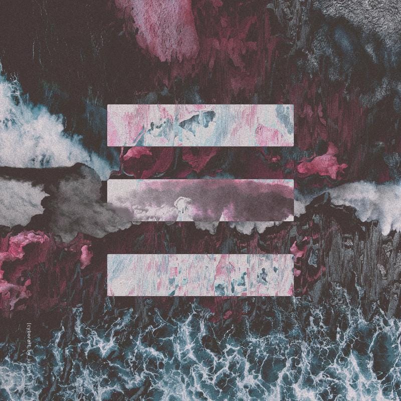
MXSA 01
This is one of his works where he adds symbols and geometry, with their cold, perfect shapes, contrasting with the chaotic complexity of nature. In this particular work it’s the tide and waves of the sea (but he also has some awesome ones with mountains and plant life too).
Looking at these makes me think that on a visual, surface level, nature and geometry seem very different, but everything is ultimately math on a micro level. It’s like the secret code that makes up the universe.
Anyway, go check out his IG profile to see some of the rest of his works.
Glitch Video
What's this? A new series in the Error Logs? And for absolutely free? You lucky devils! And for all of you that hate new stuff, I'm not sorry.
Keen-eyed glitch spotters may have noticed that the recent Linkin Park music video for the Emptiness Machine featured glitch art (Yay!) and last month I wrote about how it didn't seem to use anyone from the glitch art community directing or advising (Boo!) Each month I'm going to be taking a look at a music video that uses glitch art, video art or generative art and we can see if they fared better
I was originally going to put this together as a full list just for one issue, but seeing as this is the all new, sleek and compact Error Logs, I figured it might be nicer to do it over a few issues. That way I can spend a little bit more space for each video, and also people can suggest videos that I might not be aware of. There are around 10 music videos that use glitch or video art (although some are by the same artists) that I have on my list so far, but feel free to contact me with some suggestions if there's a song or video you like.
Anyway, seeing as it's the video that inspired this series, let's start off with Linkin Park's Emptiness Machine.
Before getting into the video, it's fair to say there's been a bit of controversy about the band's new direction. Not being a follower of Linkin Park, I don't really have a dog in this race. I am Switzerland; high on the fondue of neutrality. I'm just going to stick to the music video.
So, how's the video? Well, let's not beat around the bush here (the fondue is over), but the music video was a bit shit. There are some individual effects that are done well, but it didn't really work as a cohesive thing. It felt like the director has shoved a bunch of different glitch filters from Adobe After Effects into his mouth, and then sneezed them onto the screen. It reminds me of when I first started making glitch art and I made a bunch of glitches and tried to blend them all back together
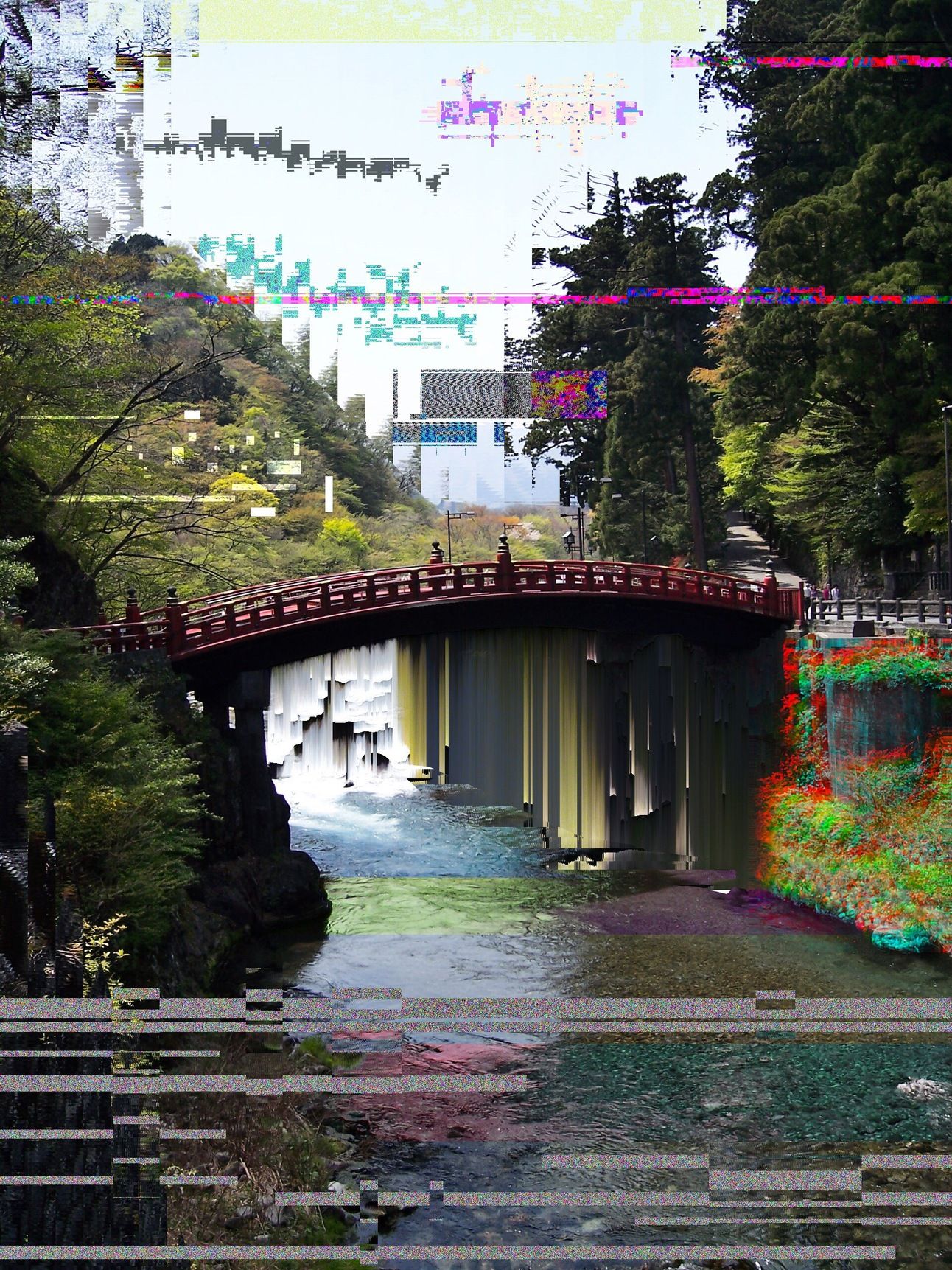
Whatever this is, tokyo_nomad_ October 2020
So, who is responsible for this hodgepodge of glitch?
Well, followers of LP will know that a lot of the art direction is done by the band’s DJ, Joe Hahn. When he’s not wicca-wiccing on the turntables, he’s putting together album artwork or directing their music videos. From what I can tell, his work his held in high regard by fans of LP, even if some of it may not have aged well.
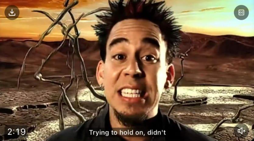
And I’m not just talking about Mike Shinoda’s hair
Anyway, onto the video itself. So the video has members of the band working salt-of-the-earth blue collar jobs. Are they playing characters? Are these their day jobs? Are they struggling to make ends meet as all the cash has dried up? It's not really explained.
It all gets a bit Matrixy as each of them glitches out and are sucked off (!) into some pixelated world where they can be free to play music until the end of time (or until the Wi-Fi goes down).
The parts where each individual band member glitches out goes crazy with the amount of different glitch effects used. I saw pixel stretching, pixel sorting, wind, chromatic aberrations, distortions, datamoshing, halftone, tiling. Here’s some screenshots I took of some of the effects
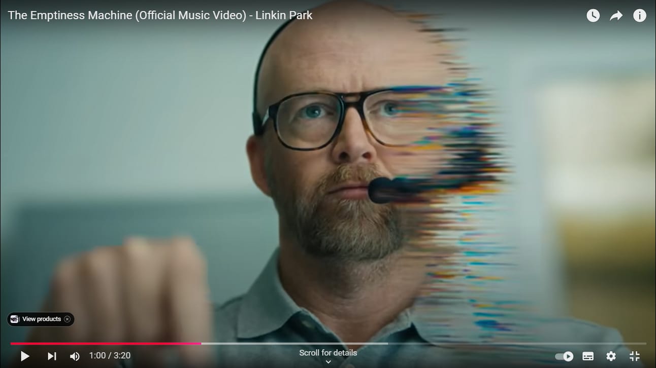
Distortions
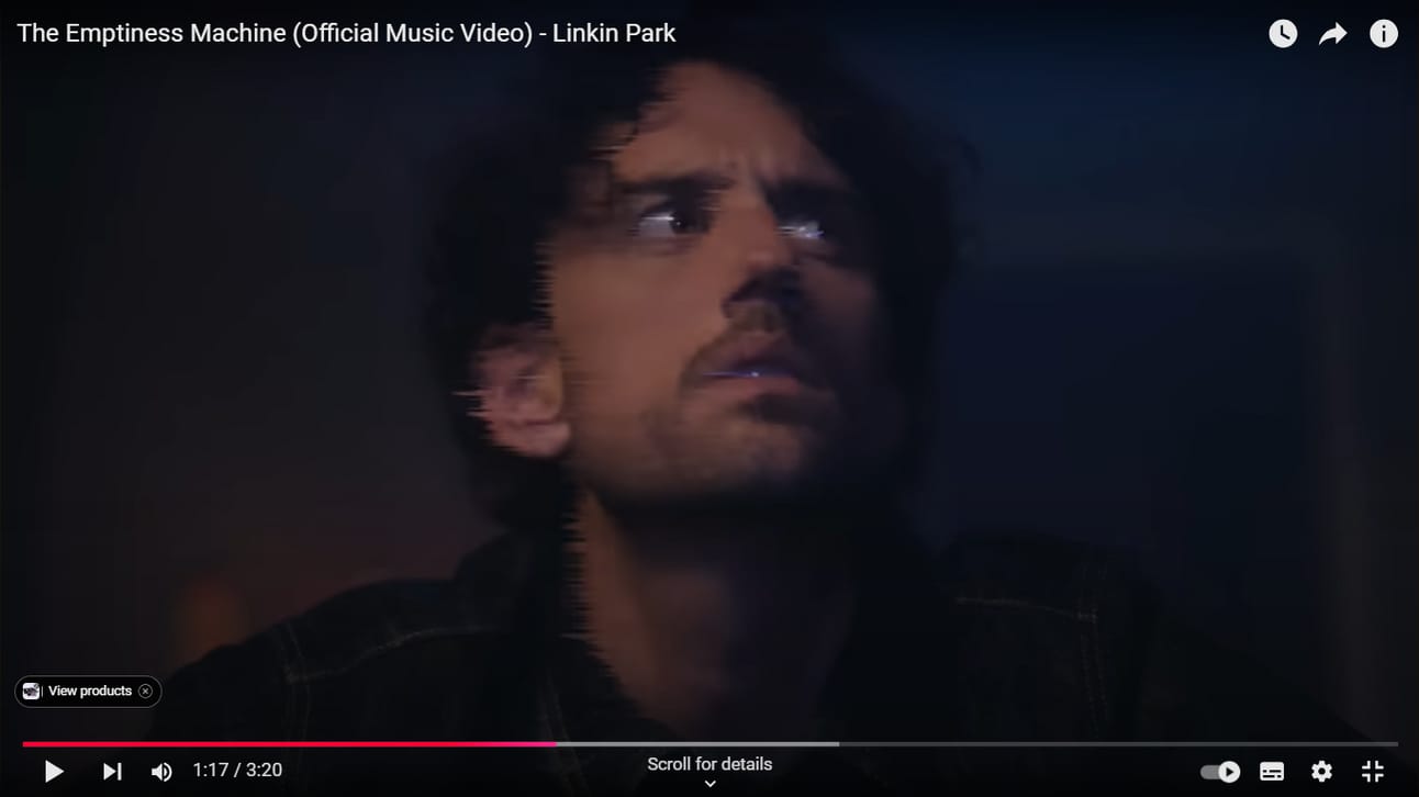
Wind
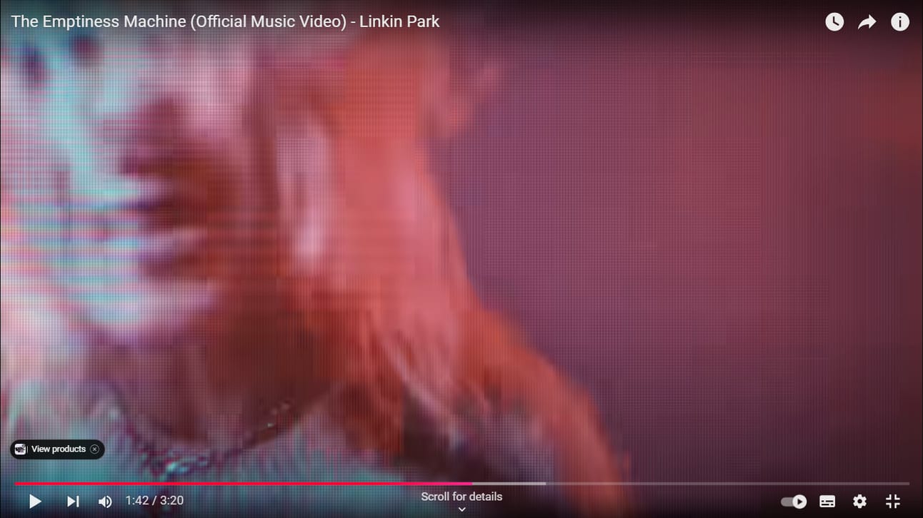
CRT TV
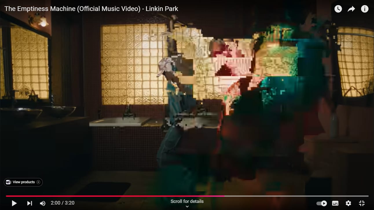
Datamoshing
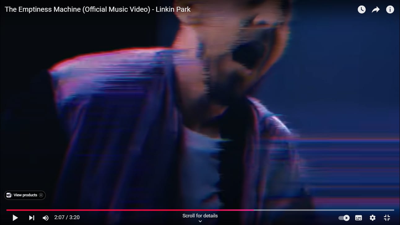
Pixel Stretch and Wind
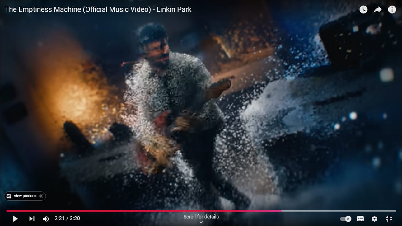
Dandruff Attack
And none of it blends well. Something I mentioned in the cyberart_by_justin Spotlight is that he is really talented when it comes to blending different effects together to make something new. I just don’t see that here. There’s way too much going on and it just gives me a headache.
The datamoshing part looks ok and I think it would have been a better video if he’d just stuck with that effect. He did some nice transitions with the effect and, even though it’s a bit gimmicky, he seems to know how to do the morphing trick well in the part where the painting comes to life.
Ultimately, I feel a bit conflicted about the video. Obviously, I feel it's a bit bum. And it's kinda sad that someone from the community wasn't asked. But I also feel a bit bad. He obviously has a passion for glitch art, as this isn’t the first time he’s used it. His previous crimes against glitch art include the Linkin Park video for New Divide, as well as a movie he directed call Mall, which has a whopping 34% audience review on rotten tomatoes. As you can see from the New Divide video and clip from Mall, they have the exact same problems. The glitches just don't feel baked in. Just a collection of overlays. But looking at the positives, it's generally a good thing when glitch art gets a bit of mainstream attention and helps bring it to a wider audience. We’ve seen how many artists of my generation were influenced by Rob Sheridan. Perhaps in a few years we’ll have an army of Hahnimaniacs.
Anyway, come back again next month and we’ll take a look at some more glitchy music videos
Tool Time: Pix2Line 🌽
Our series on Processing scripts continues for another month. And this month I have a special treat, as we're going to be looking at a tool from glitch art's best kept secret, GenerateMe. I've mentioned GenerateMe a few times before in these pages, but it's basically a pack of scripts for Processing that has a bunch of stuff that's really good for glitch art. GenerateMe was created by Tomas Sulej. I linked his blog a couple of issues back which has tutorials and his processes for making things in Processing, so if you're interested in writing your own code, I highly recommend checking it out. You can download the Generate Me scripts here, and he also has a nice tumblr with examples of the scripts here. If you just want to download the pix2line scripts, those can be downloaded here.
So, what is pix2line?
According to the explanation, it converts pixels into lines snapped to a noise grid. From what I can tell, it basically takes the righter most vertical line of pixels of each section of the grid and stretches them horizontally across the grid. So, you get these big fat cubic sausages of glitch. Everyone is familiar with pixel sorting, so if pixel sort is Lego, then this is its Duplo brother.
Here are some examples of my works using this script (these aren't all raw outputs and sometimes other editing has been done to the images)
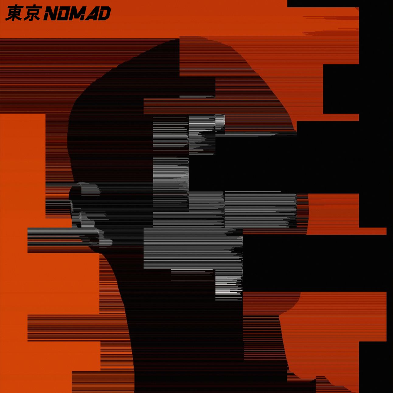
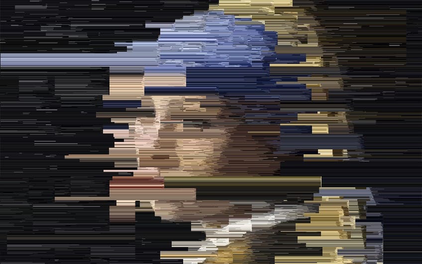
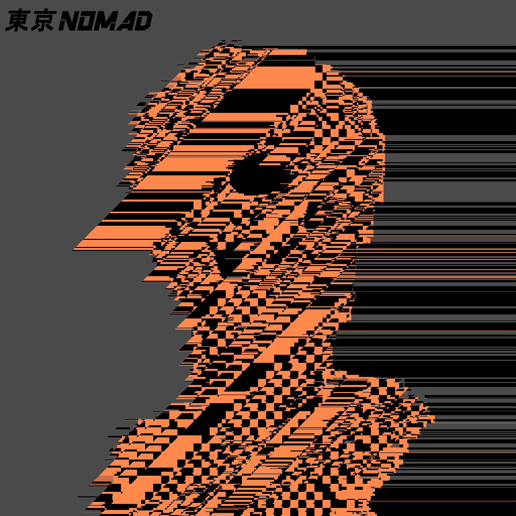
I'm not going to go into a big tutorial on how to use it as I've covered the main points before and it's really easy. So, if you're a complete newb to Processing, check out Error Logs Issue 8 for my Processing Primer tutorial. If you're already familiar with Processing, here’s a quick rundown.
1. Download the script
2. Open the script in Processing 2
3. Make sure the image you want to edit is in the same folder as the script
4. Change the file name in the script so that it loads correctly
5. Press play
6. Hit space to save the output
7. Left mouse click to apply random parameters and generate a new output
So one method is to just keep clicking until you find something worth saving (nihilists can keep clicking ad infinitum)
Alternatively you can fiddle around with the settings and hit play. If you don't like the output, hit stop, change the parameters, and hit play again. That should apply the changes you make.
So first, let’s take a look at the grids
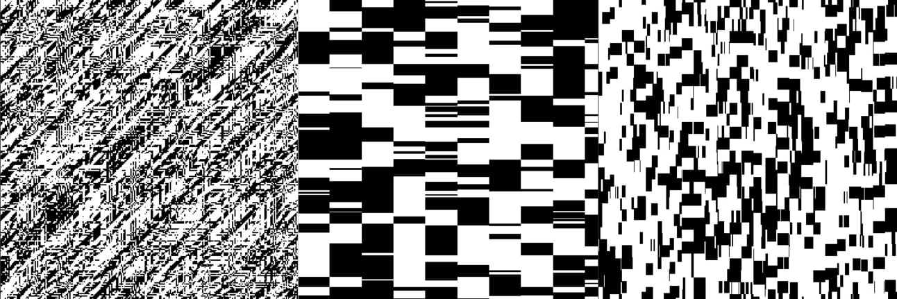
So these are the grids that are saved in the folders with the rest of the files. At first, I thought these were the actual grids that were being used as a kind of map to distort the image. But actually, looking at the code, it doesn’t seem to reference these grids anywhere, and removing them from the folder doesn’t seem to stop the code from working properly. Now, I’m no coder, so I may be misunderstanding what’s going on here, but I’m assuming that a new grid is generated each time you run the code or hit random parameters, and these images are just examples of what the grids look like. But that’s just my guess and there’s no indication anywhere if that’s true at all. None at all

I didn’t just find this after I wrote this whole section out
I guess that’s a shame because I kind of wanted to try running the code with my own grids; layout grids, sewage grids, the power grid, the gwiddy, and the griddiest of all the grids; the Belgian waffle 🧇
Anyway, less waffle (didn’t I say that earlier?), let's look at what the settings do. Like I said, clicking the left mouse button will randomize these settings, so if you want to actually reproduce the parameters you tinker with, you need to hit the stop button, change the parameters, then hit the play button again.
Let’s use this image as a base
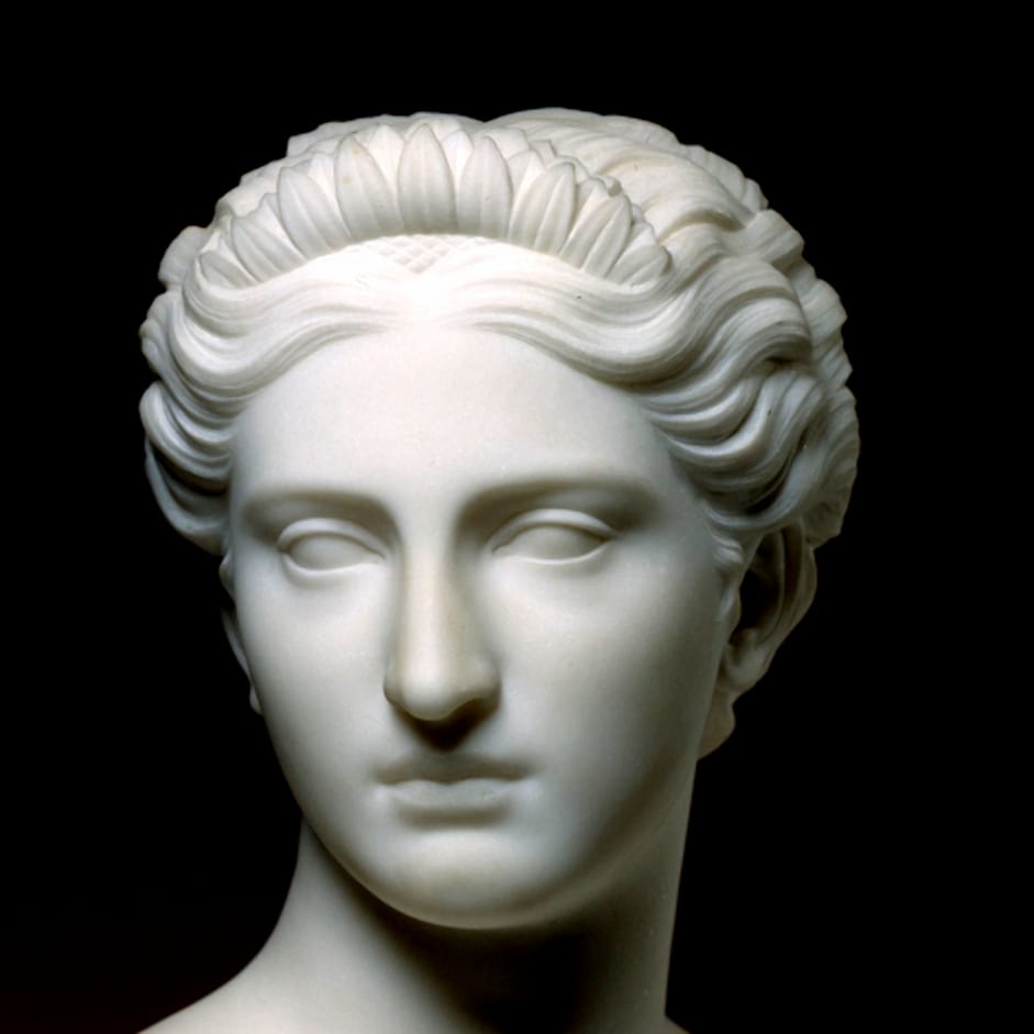
Clytie, Hiram Powers, SAAM
This is the result you get when you just apply all the default parameters
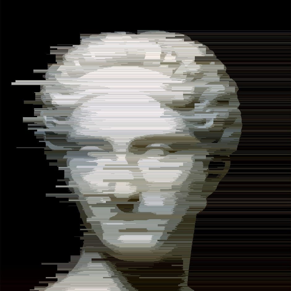
Basic
Looks pretty good. I’m pretty chuffed with that so let’s pack up and go home.
Just joking.
Anyway, there is some still some randomness to algorithm at this point. So if you save the output, hit stop, then press play again, the second output is slightly different. But you can make bigger changes when fiddling with the parameters
First, let’s look at playing with the size of the grids
// configuration
// average noise grid size, examples of generated grids are in grid_examples folder
int nx = 30; // 1 - width
int ny = 20; // 1 - height
You can change the average size of the grids. The example above was 30 width and 20 height. Let’s see what happens when we play with them a bit
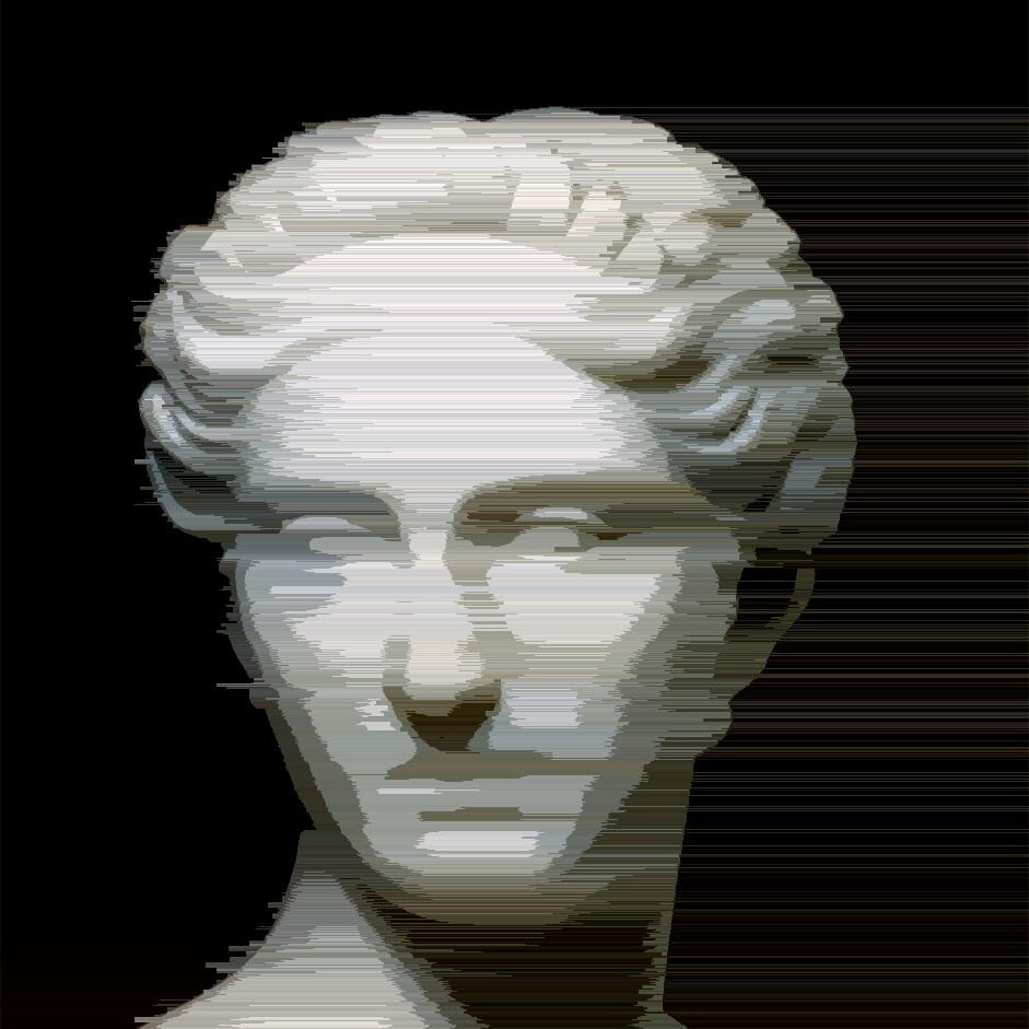
10 Width, 20 Height
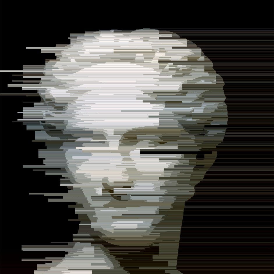
50 Width, 20 Height
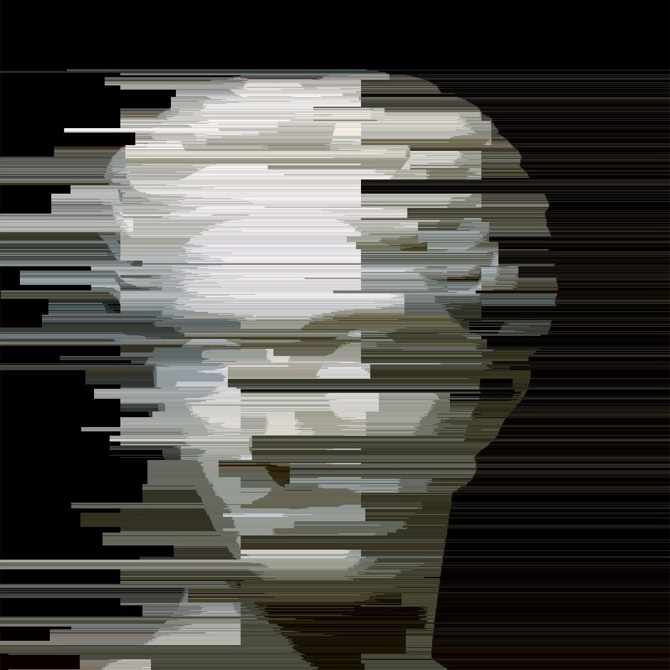
100 Width 20 Height
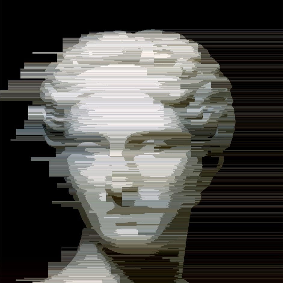
30 Width, 100 Height
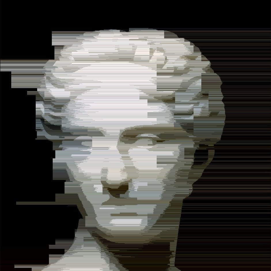
30 Width, 150 Height
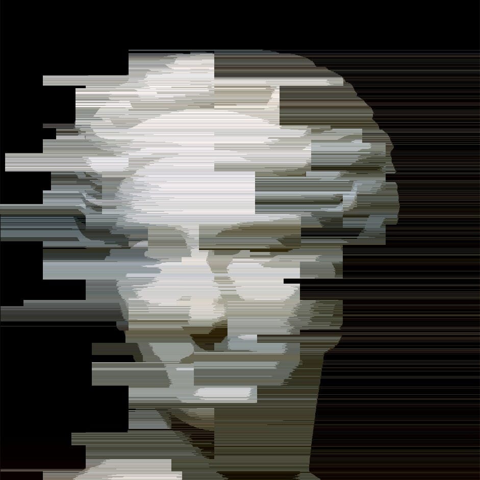
100 Width, 100 Height
Now one thing I noticed. As I mentioned before, hitting the LMB after generating your first output will apply random parameters to the next output, however the grid size is locked. So if you find a size you like, you don’t need to keep hitting stop each time and you can use the LMB to generate new parameters with the fixed grid size. If you want to just play with the chaos of totally random parameters including the grid size, you can hit G to toggle the grid size being locked during randomization ‘on’ or ‘off’
Now, let’s look at some other parameters
// tolerance of channel value change, this is kind of edge detection sensivity
int tolerance = 50; // 1 (every channel value change starts new line) - 255 (one color line)
// channel to test
int channel = BRIGHTNESS;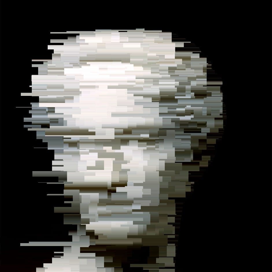
1 tolerance, default grid size
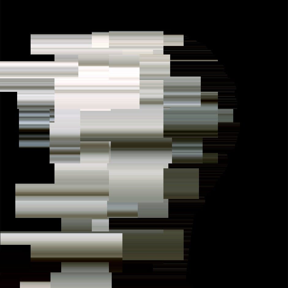
1 tolerance, 100×100 grid size
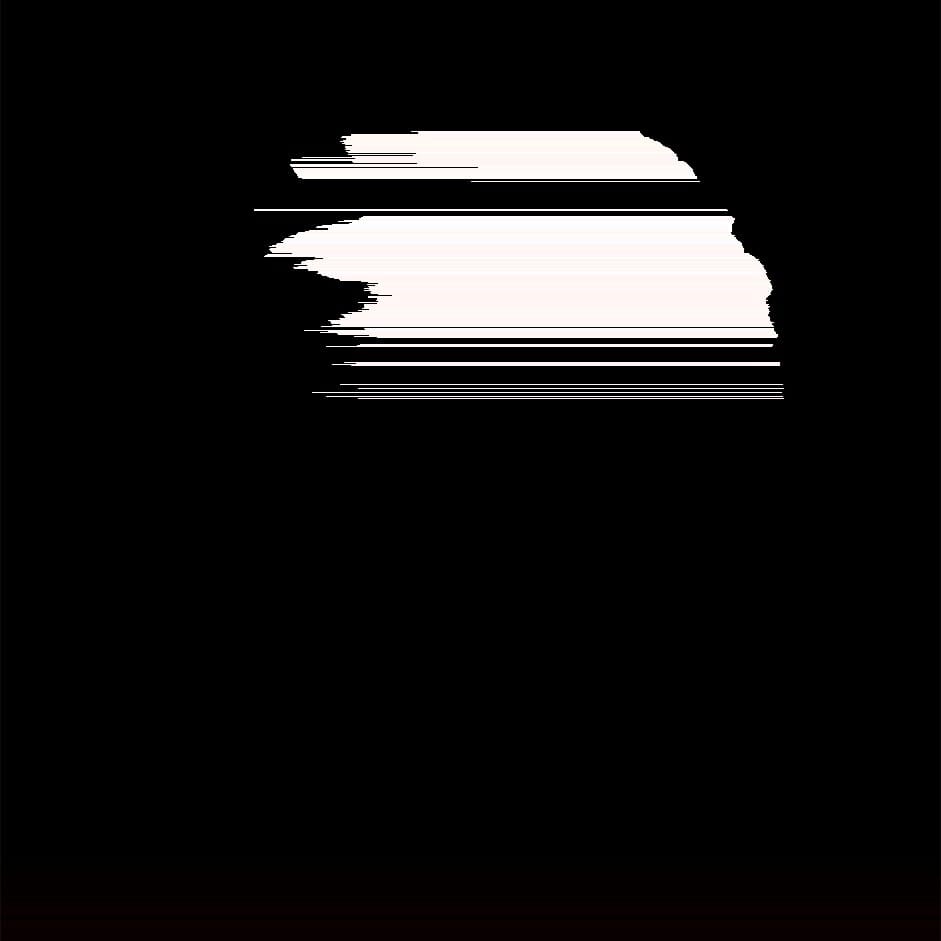
255 tolerance, default grid size
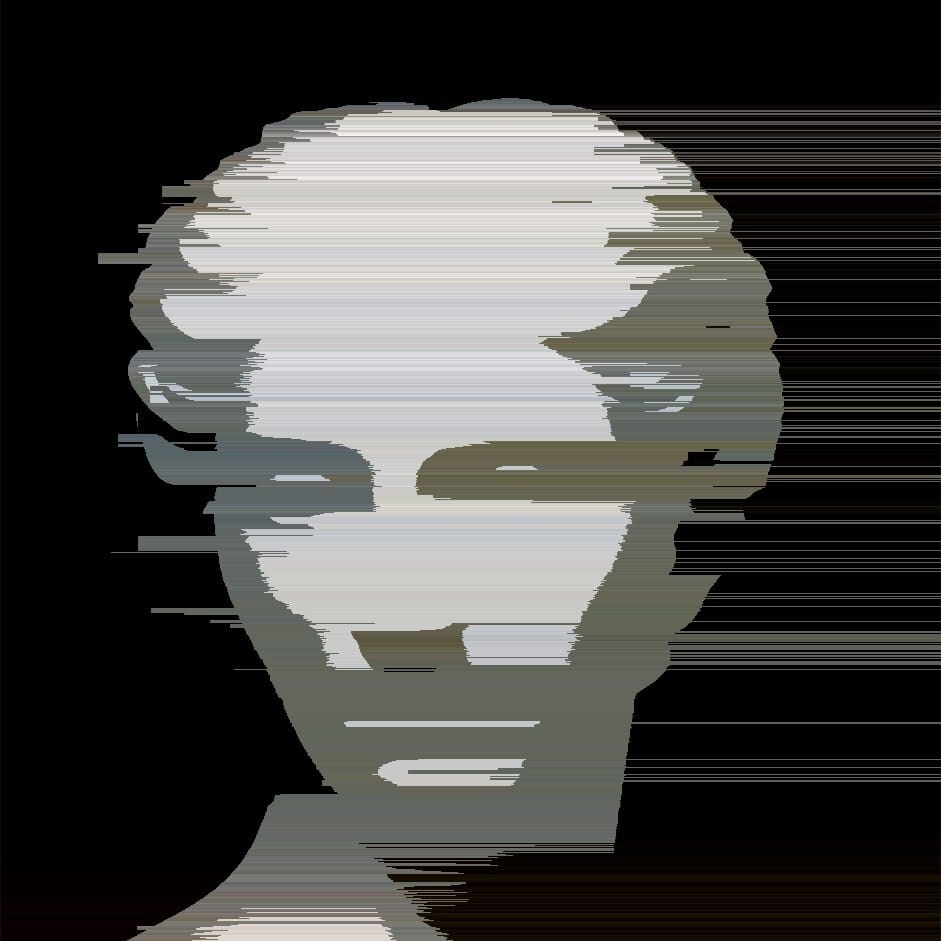
100 tolerance, default grid size
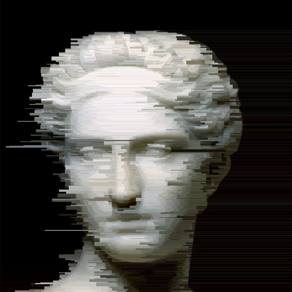
25 tolerance, default grid size
You can also play with the channel. The default is BRIGHTNESS, but you can also play with:
RED, GREEN, BLUE, HUE, SATURATION, NRED, NGREEN, NBLUE, NHUE, NSATURATION AND NBRIGHTNESS
N stands for negative. Which I’d assumed means it works on all channels except that channel. So Red works on the Red channel, N red works on all channels except Red. But there didn’t seem to be a huge difference between the regular versions and their N counterparts. So I’m not 100% sure on that point. Please feel free to let me know if you do know.
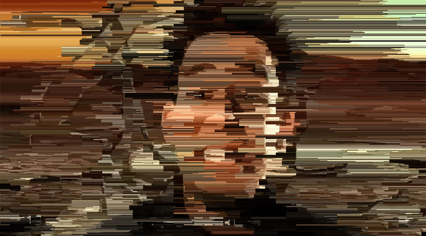
I’m going to switch to a more colorful example image for this one so you can get a better idea of how things look. Because I’m lazy, let’s reuse the screenshot of Mike Shinoda on the cover of an early 90s computer magazine from earlier.
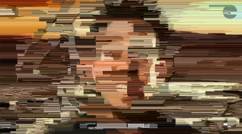
Brightness
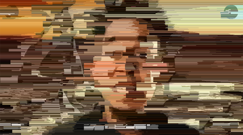
Red
Saturation
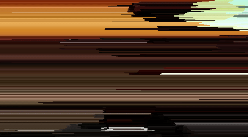
Hue
Hue didn’t end up looking all that great, so I’m not sure if I’ll be getting the call from Linkin Park for their next music video
If you want to keep the original intact, Hue seems to work better on black and white images (although that’s with the default Overlay blending mode. YMMV if you use other blending modes for color images)
Here’s hue again with the old image
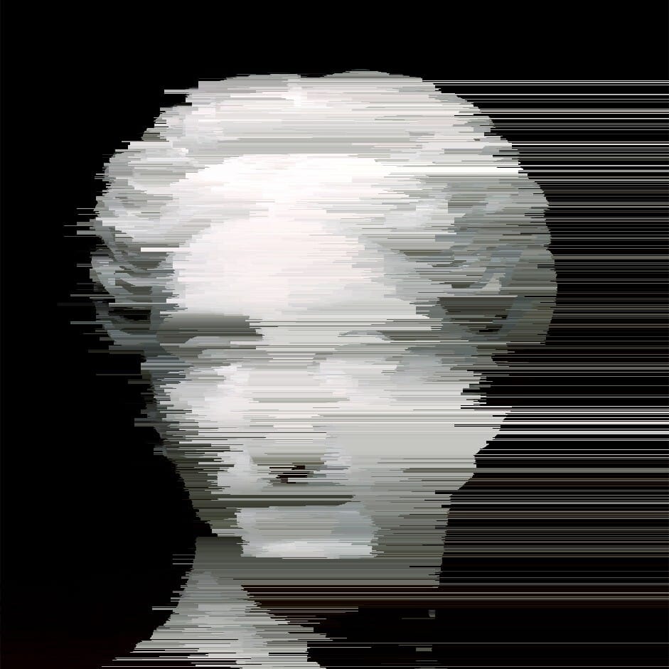
hue
Next thing you can do is to fill the gaps between the grids with a background colour.
// fill the gaps between grids, if false fill them with background_color
boolean whole = true; // true or false
// color to fill grid gaps
color background_color = color(188, 188, 188);
You need to switch the setting to false and then choose your colour (the default color is 188, 188, 1888, which is a light grey
I’m not going to spend much time showing you what this can look like because I haven’t found a good use for it, so here’s just one extreme example to give you a clear idea.
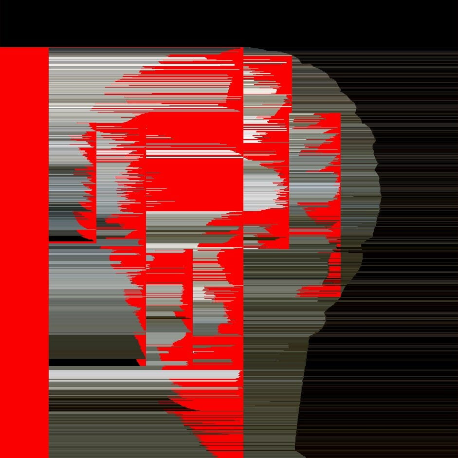
It would probably work best to use colours that are already in the image, like black or white for the example above.
The last thing you can play around with is how the output is blended with the original input.
boolean do_blend = false; // blend image after process
int blend_mode = OVERLAY; // blend type
By default, it won’t blend it the input, so you’ll need to switch false to true.
Here’s a list of blend modes you can use: ADD, SUBTRACT, DARKEST, LIGHTEST, DIFFERENCE, EXCLUSION, MULTIPLY, SCREEN, OVERLAY, HARD_LIGHT, SOFT_LIGHT, DODGE, BURN
I’m not going to share all of them as there’s a lot, and not all of them looked interesting with the test image
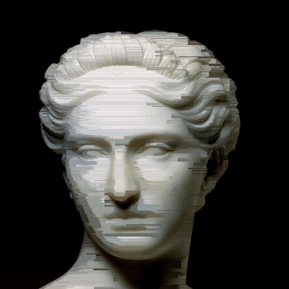
Darkest
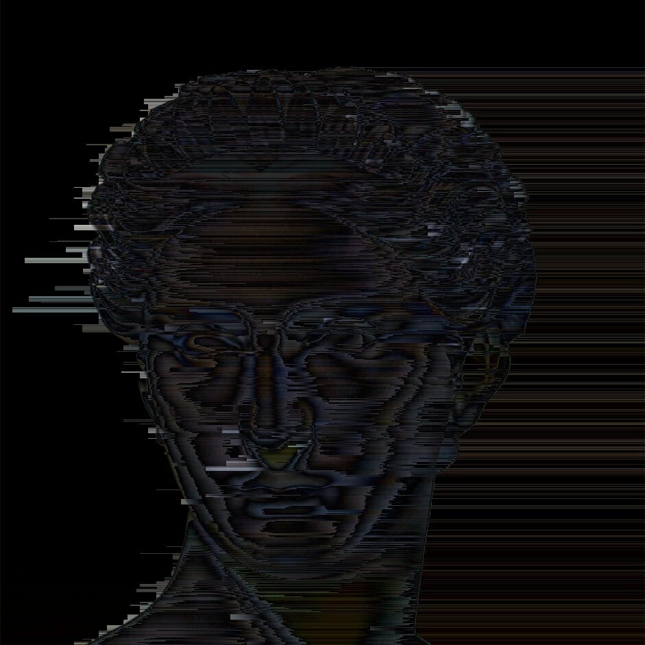
Difference
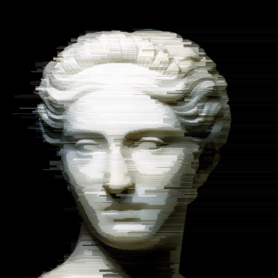
Soft Light
Finally, it’s not something I really know how to control, but sometimes you get these cool diagonal effects. It’s probably something to do with the random grid generation (kind of like grid 1 in the examples I showed) I don’t know how to recreate it, so sometimes you just have to keep hitting LMB ‘til you get the diagonal grid
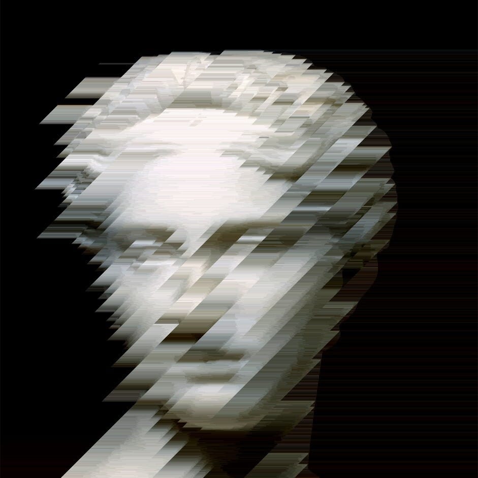
Here are a couple more variations that I generated that I thought looked pretty cool.
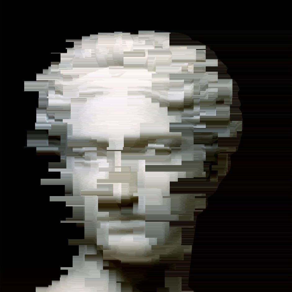
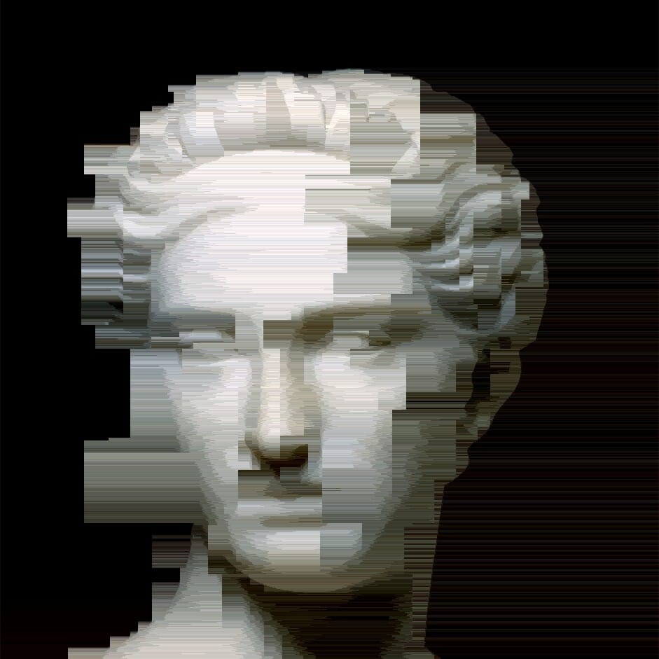
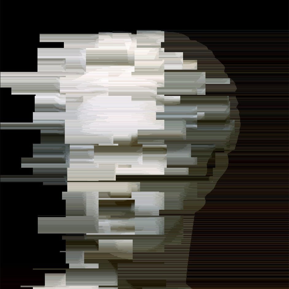
And of course, you can then take the output and then run other scripts or databend in other ways.
So that brings us to the end of another Error Logs. I guess it didn’t really end up being much shorter than usual (at least not the full thing). But hopefully having shorter sections will make it easier to write in future and also make it easier for you guys to read.
If you haven’t already subscribed, please think about doing so, and don’t forget to take a look at Issue 4 where I played around with cyberart_by_justin’s Glitch FX tool.

